Omnicell


Figma design library
First Person invited me back to help redesign the Omnicell homepage. The client wanted to add a news section featuring events and updates. As a prerequisite, I was allowed a few days to organize the Figma project and design library.
Initial assessment
Transition to Figma
First Person had migrated the Omnicell project while I was away. They had imported my Sketch library, but they didn’t update it to work as a Figma library and only used it as a reference.
As a result, designers were creating their own design systems for each design file. This was causing inconsistencies and fragmentation throughout the project.
Step 1
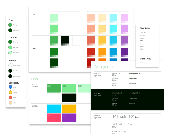
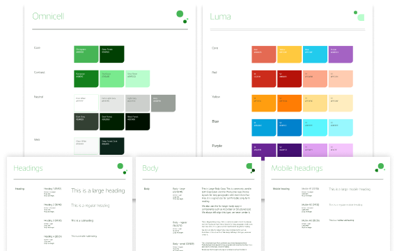
Consolidating styles
The first step in building a design library is to establish text and color styles so every element that follows can refer back to a single source.
I only had a few days to work on the library, so I decided it would be best to start fresh.
I migrated style values from the imported Sketch library into a new shared library. Then I searched through the feature files, looking for updates or additions, and consolidated any styles that would be universal to the overall project.
Step 2
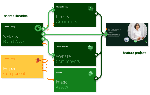
Modular shared libraries
The new Figma library consists of modular shared libraries. Modular libraries are smaller and easier to update in small bursts. They can also be hidden individually to reduce clutter in the Assets panel.
At the foundation are Styles and Brand Assets. This is a lightweight library that all other libraries and projects would refer to for text, color, & other styles.
I also created an Image Assets project to be a dumping ground for large image files that often weigh down library files.
Step 3
Atom components
My time was limited, so I focused on creating components for commonly used assets like icons, ornaments, buttons, and text blocks. They would essentially be the atoms of an atomic design library.

Step 4
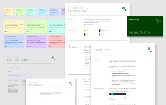
Helper components & documentation
Inspired by Figma's best practices, I created a Helper Components library. These are non-production, internal components for organizing designs:
Cover Kit (Figma project thumbnails)
Sticker Sheet Kit (documentation)
Sticky Notes (internal notes)
I also added an Introduction Kit for new designers. Each library has a “Start Here” page with instances of this documentation. The kit explains how to use Figma shared libraries and how it's all organized.
Selected works

Adobe ConsonantDesign library for the global leader in digital media

LookoutDesign library for the leading provider of data-centric cloud security

First PersonDesign libraries and technical design for a B2B discovery & design agency

VectraDesign library for the world leaders in AI security

OmnicellDesign library for the pioneers of autonomous pharmacy
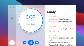
EpilogDesign & development of a smarter Pomodoro activity log

Disney Movies AnywhereAndroid design & development for the family entertainment giant
HD WidgetsDesign & development of a #1 ranked Android app

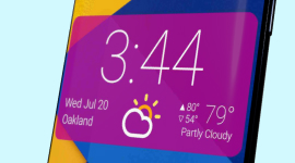
DayframeDesign & development of a social media photo frame app

App StatsDesign & development of a metrics app used by Google

CloudskipperDesign & development of a popular free music player

Starsky RoboticsUX research & design of a remote-driving system for an autonomous trucking start-up

Flash design & developmentAdobe, Honda, NFL, Zynga, and more (2003 – 2010)

ElementalCreative graphic design and illustration(1994 – 2003)