Fitness goals
Design Exercise
Fitness goals
For my Varo interview, I was asked to spend a few hours designing a fitness app that allows users to set daily and longitudinal exercise goals. I was to show design thinking, sketches of my progress, and key screens as wireframes and at high fidelity.
Screenshots
Market research
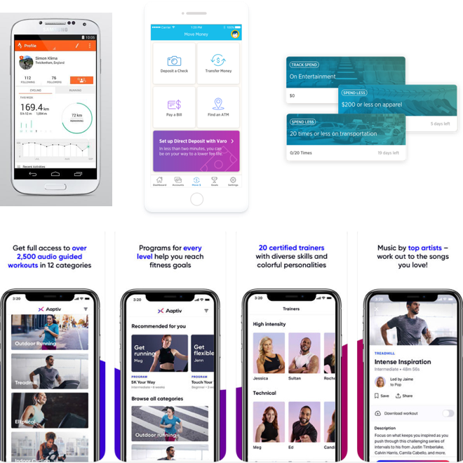
I began by reviewing the company's banking app which included similar goals for saving money.
Next, I reviewed popular exercise apps to look for common patterns and solutions for tracking goals. Strava and Aaptiv were strong examples I could follow.
Mind Mapping
User types
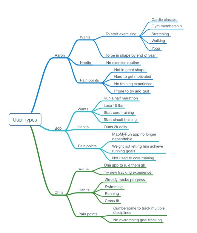
I started brainstorming user types for beginner, experienced, and advanced users, making quick assumptions about their effort and commitment.
User journey exploration
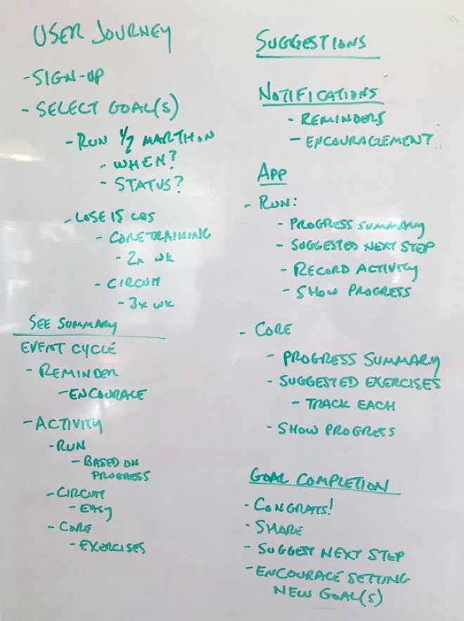
I decided to focus on a single user: he would be an experienced runner who wanted to run a half-marathon and drop 15 lbs through core training and circuit training.
The task cycle would be:
- Add a goal
- Report progress towards that goal
- Complete and check off the goal
I broke down each step and considered affordances for each, including ways to automatically support and encourage the user through reminders and affirmations.
Single user
That was still too much for a small exercise, so I narrowed down the parameters even further to a single goal of running a half-marathon. This set me up with something I could deliver within the allotted time.

Sketches
User flow
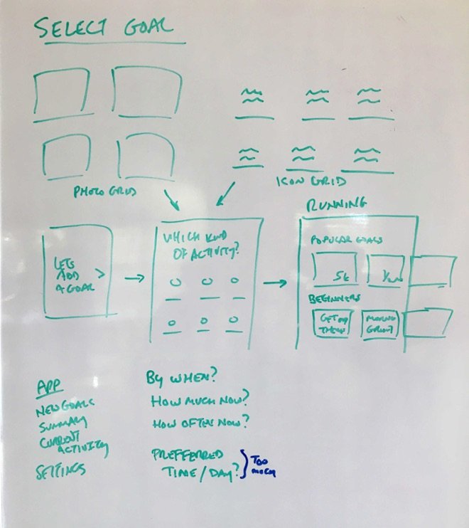
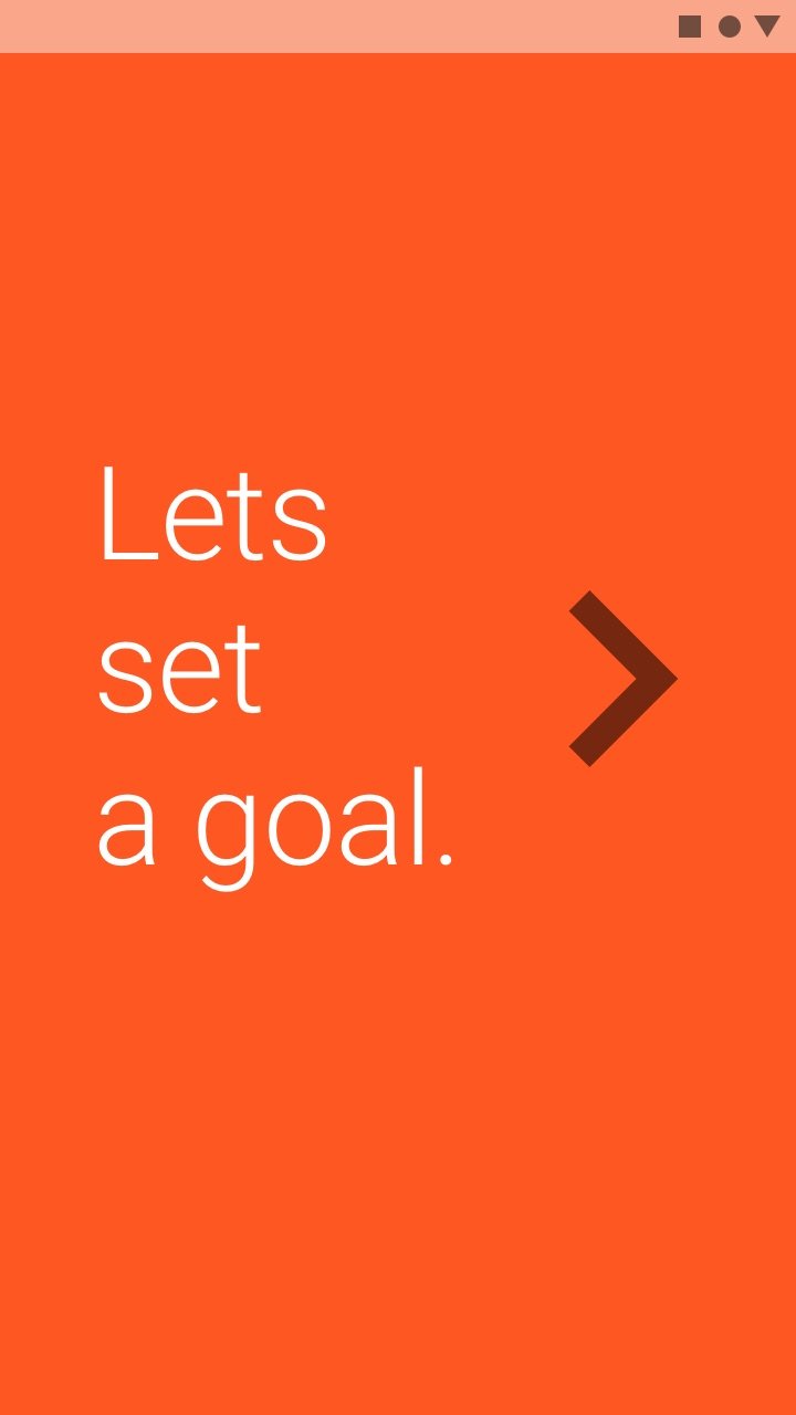
I decided that the easiest way to tell my story was through an onboarding scenario.
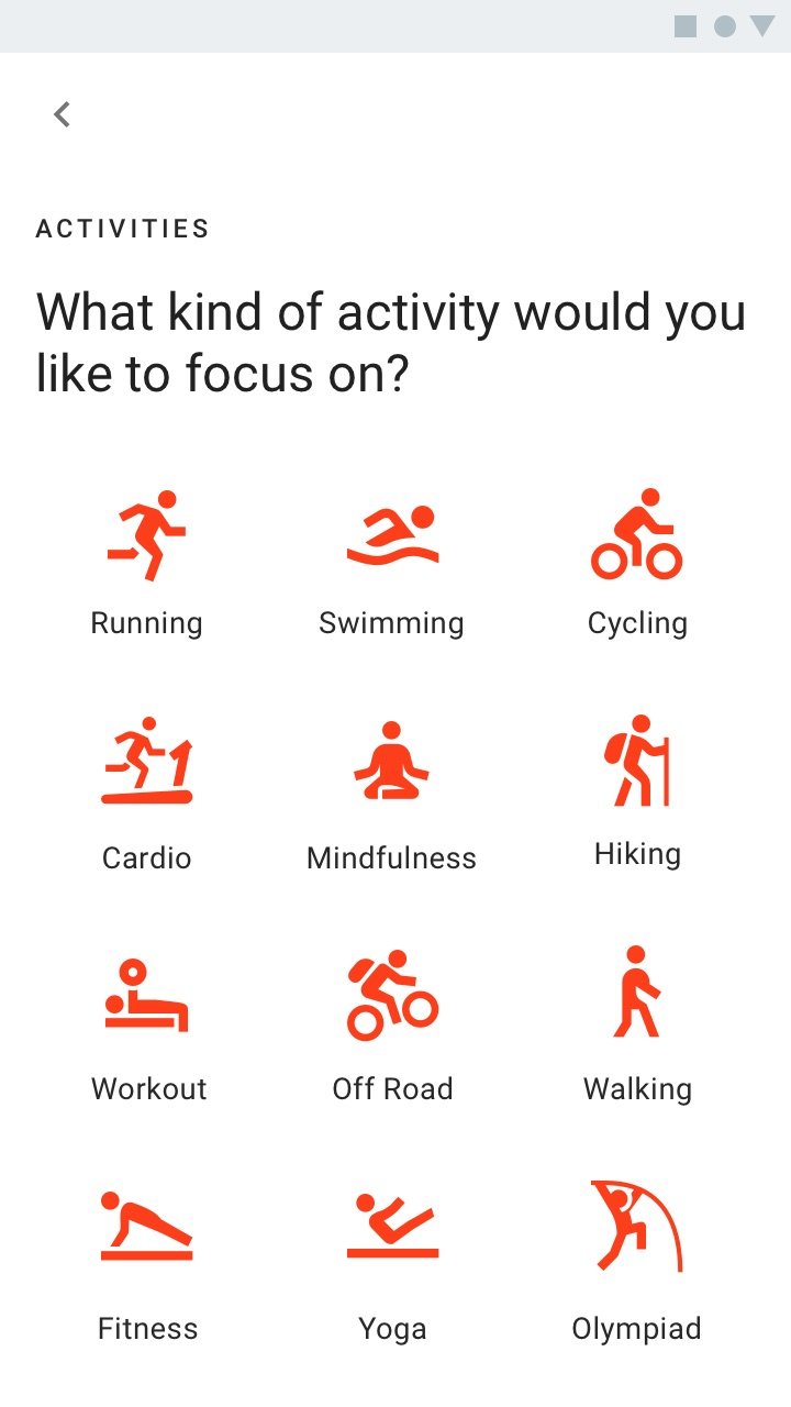
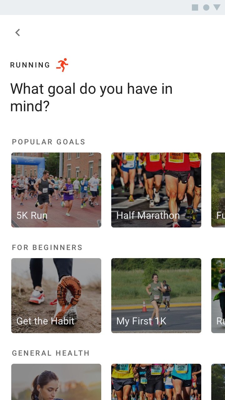
The app would start with a grid of popular categories. Selecting a category would present suggested goals for that category based on popularity, skill level, and benefits.
Success metrics
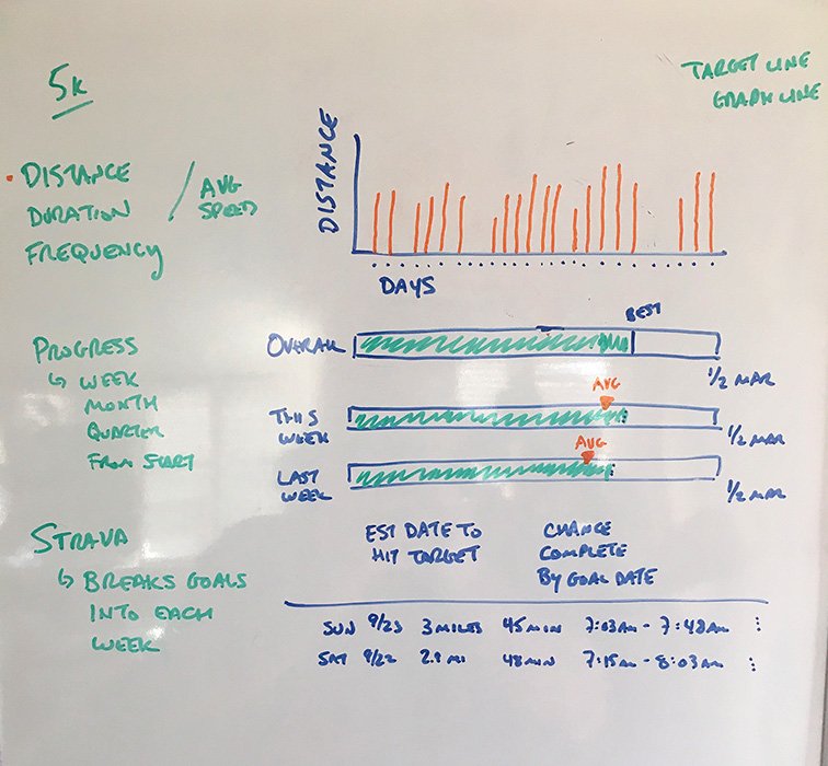
A user training for a half-marathon will want to track each run leading up to the event. A 30-day bar graph should be a good way to measure achievement. A sloped line behind the graph would represent the increasing progress level required to hit the goal.
Progress bars seemed a good way to measure overall progress against this week and last.
I also added a history list, which gave the user the chance to add, remove, or edit their runs.
Wireframes
Onboarding & finding a goal
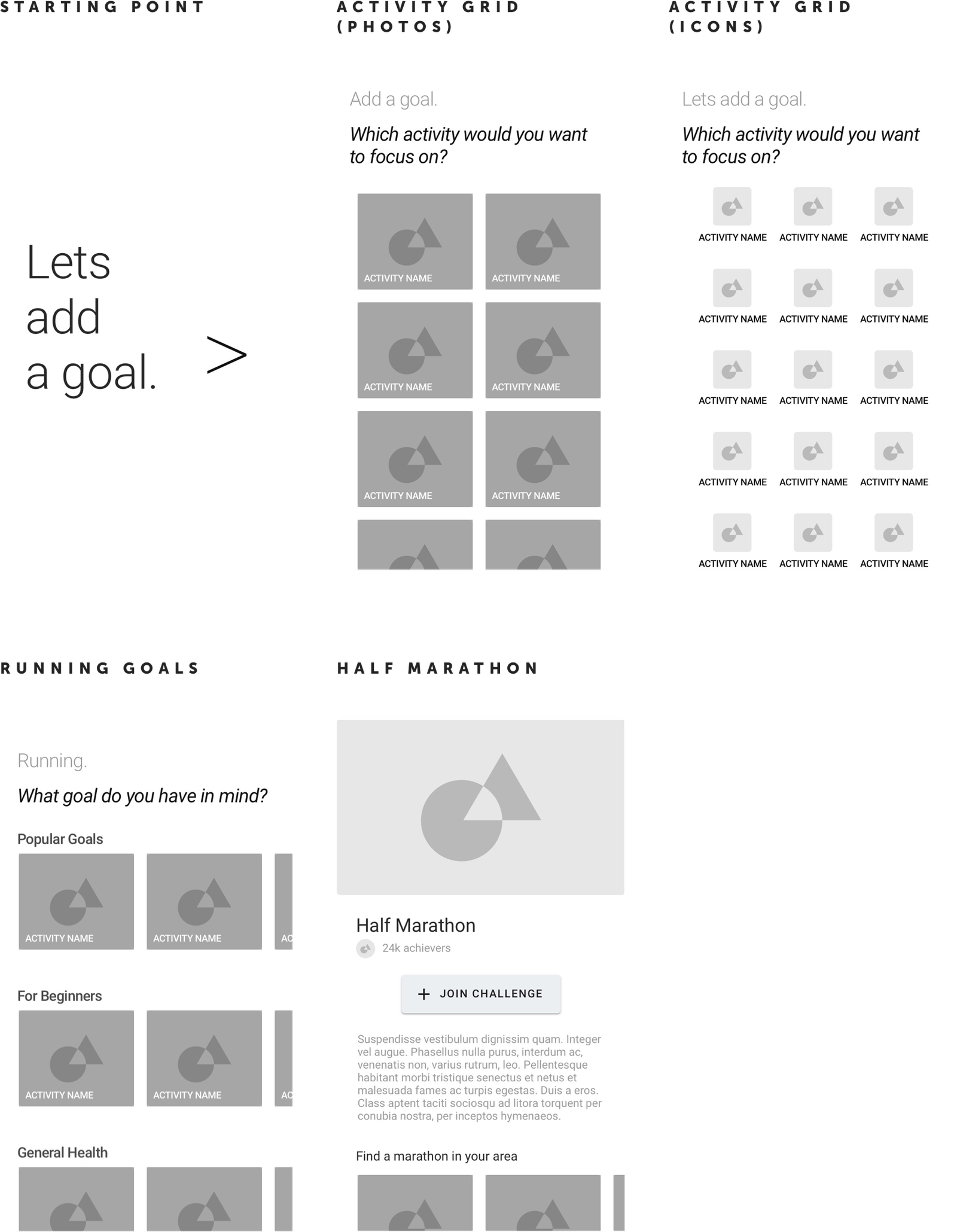
I started with a simple entry point. I then considered a couple of exercise grids.
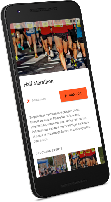
Each goal has a simple layout containing a hero image, title, call to action, and short description.
For encouragement, I show how many people had signed up for this goal (rather than how many have completed it).
I also included a list of upcoming events which would give the user opportunities to complete the goal.
Setting & tracking goals
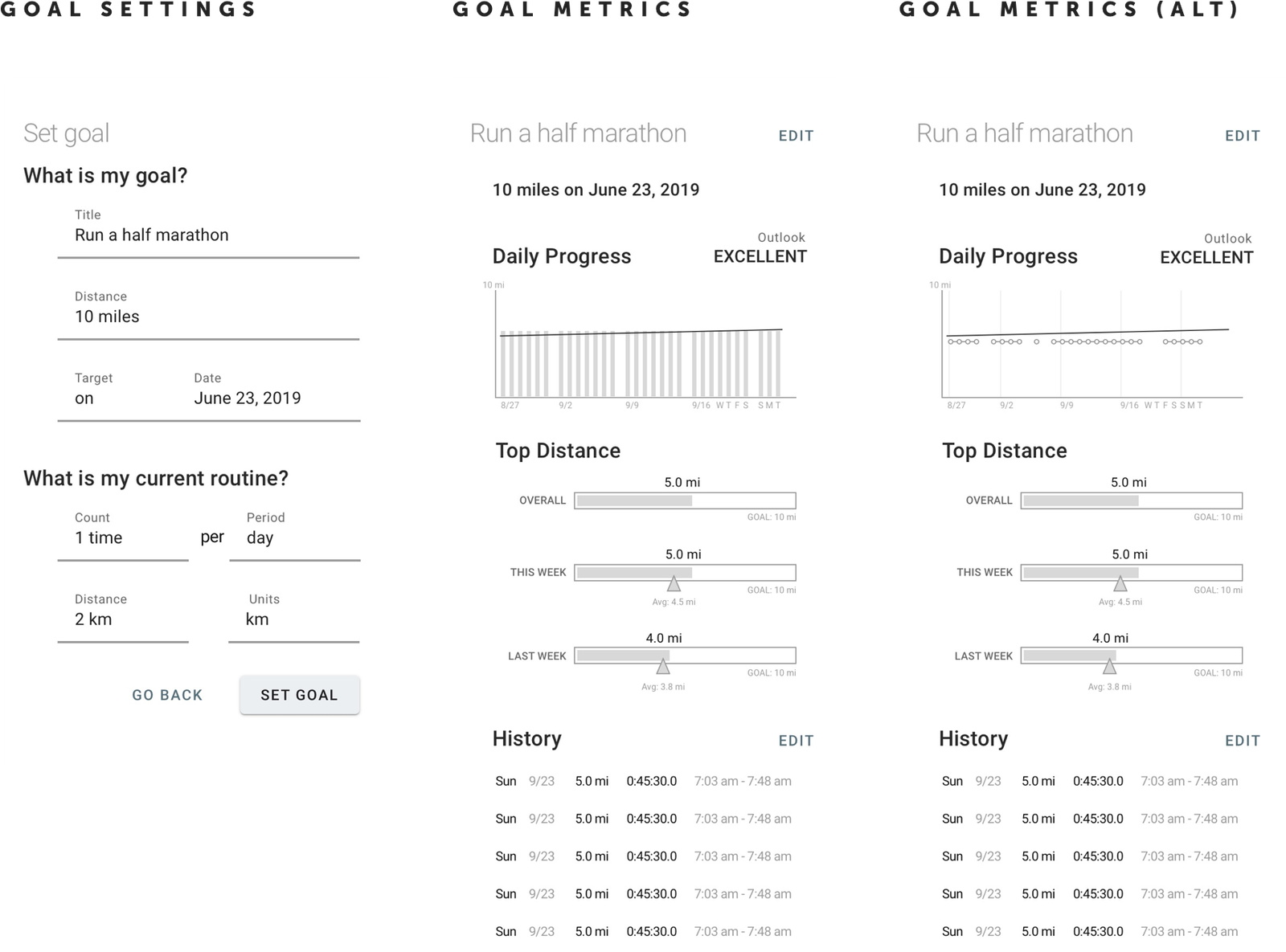
I laid out a rough idea of the required settings.
Metrics would display running distances for the last 30 days. Behind the bar graphs, I added a sloping dashed “goal” line to indicate how much the user needs to progress each day to hit the objective.
Progression bars would compare overall progress to this week and last week.
Explore / My Goals
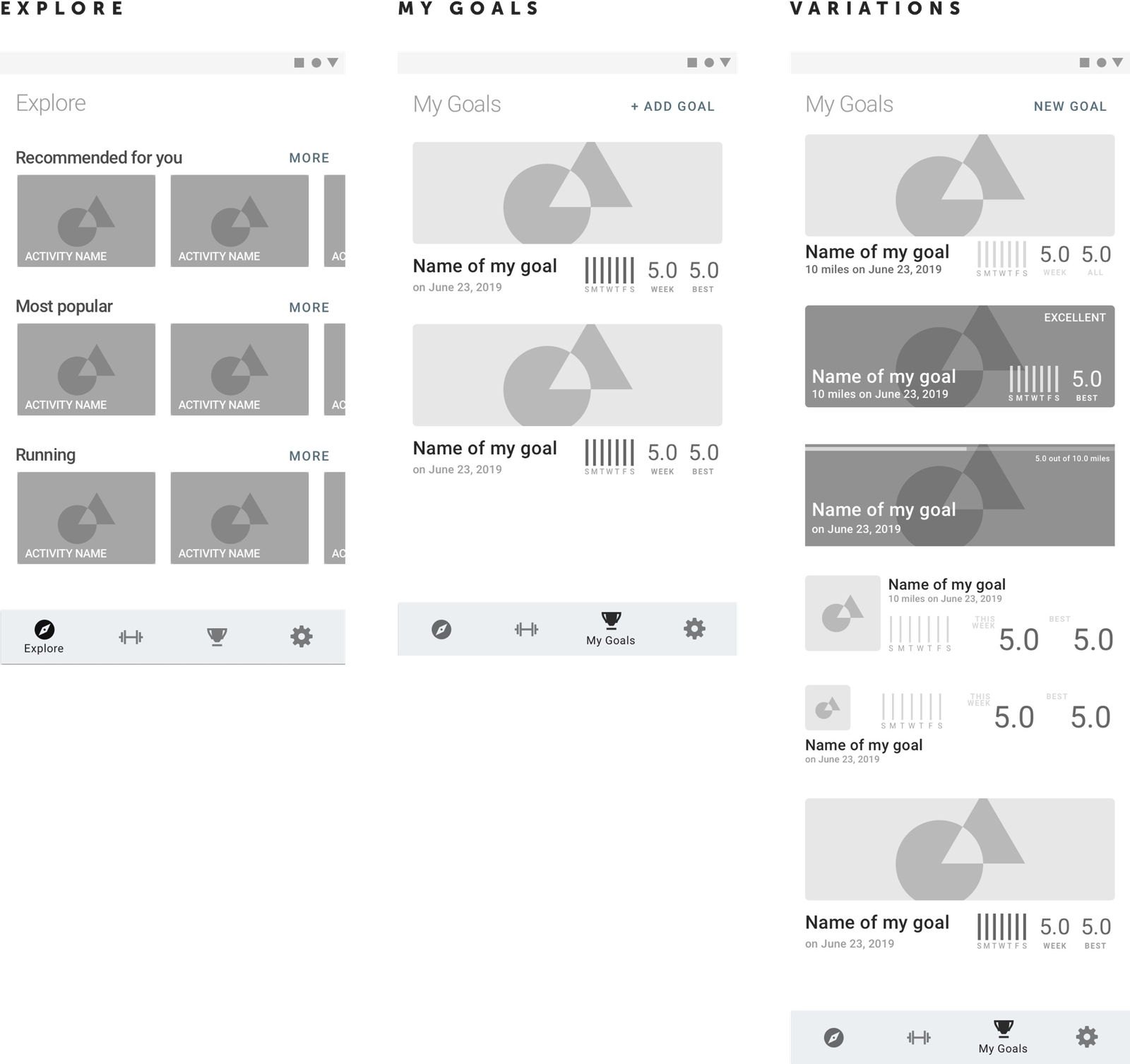
The user could have multiple goals, so I needed to consider how to find more goals, how they would look in a list, and how to summarize the data.
High Fidelity
Onboarding & finding a goal
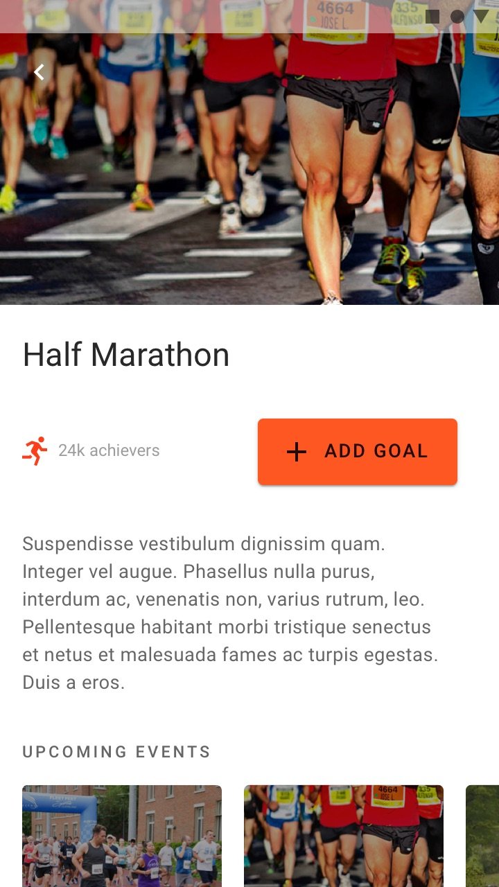
Each goal has a simple layout containing a hero image, title, call to action, and short description.
For encouragement, I show how many people had signed up for this goal (rather than how many have completed it).
I also included a list of upcoming events which would give the user other opportunities to complete the goal.
Setting goals
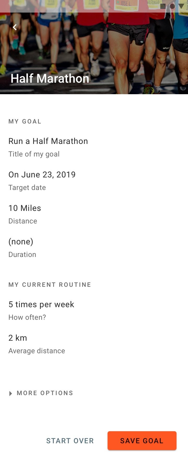
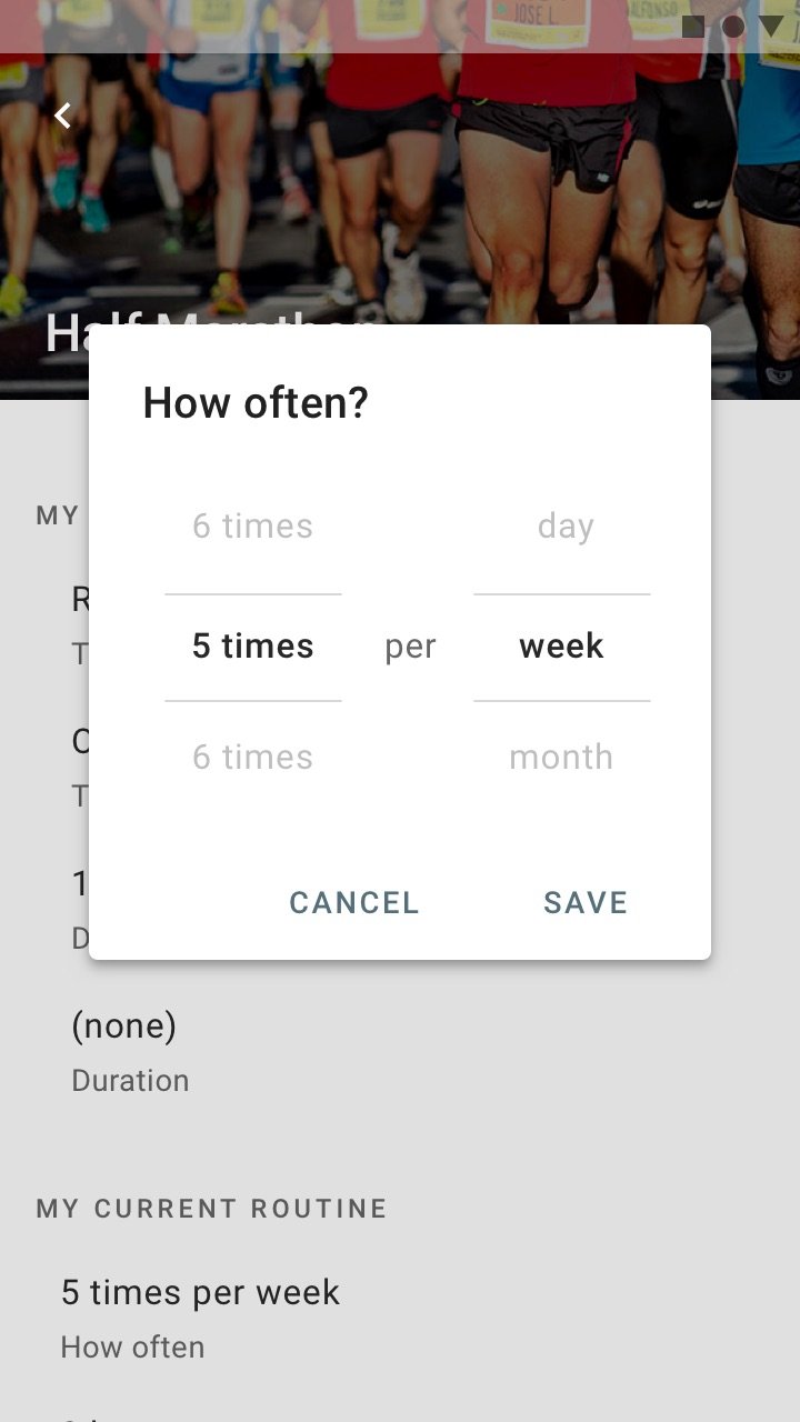
I kept the settings simple but detailed, including options for target date and/or duration.
I do require input for their current routine. This makes it possible to predict the progression required to hit the goal.
Tracking goals
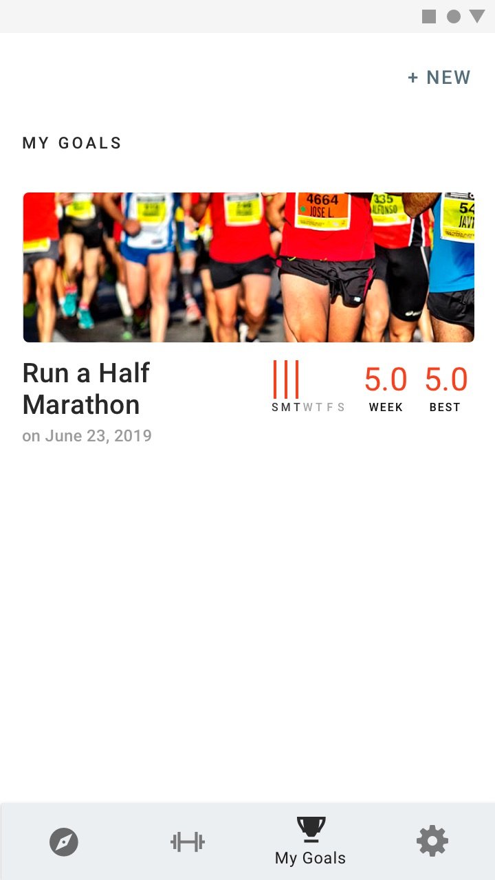
My Goals would show a list of goal cards. The card contains a hero image, title, completion date.
On the right side are quick metrics for what was accomplished this week, the best result of the week, and best overall result.
Exercise metrics
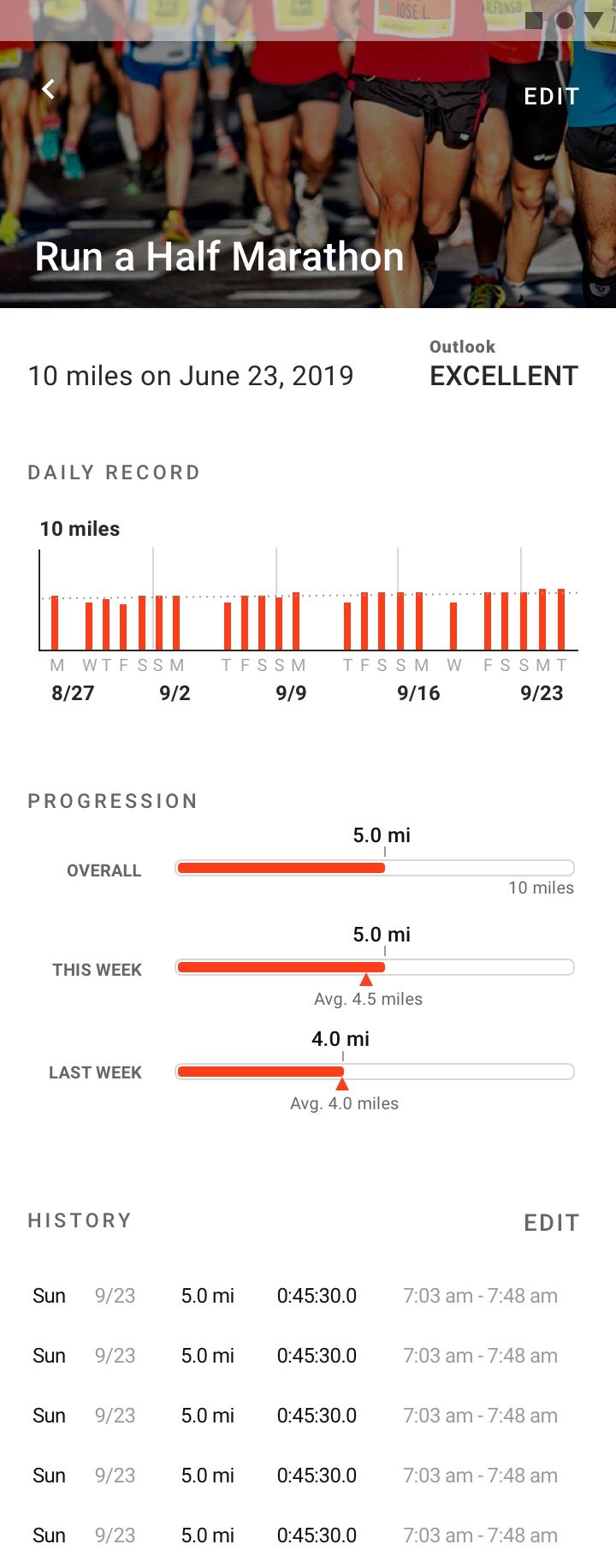
I reduced the wireframe design to fit more data within the screen. I added an Outlook prognosis. I think it's essential to be honest and help the user achieve the goal, even if it means resetting expectations.
Daily Record displays running distances for the last 30 days. Behind the bar graphs, I added a sloping dashed “goal” line to indicate how much the user needs to progress each day to hit the objective.
Progression bars turned out ok. I left them in since they made the demo more visual.
Navigation & exploring goals
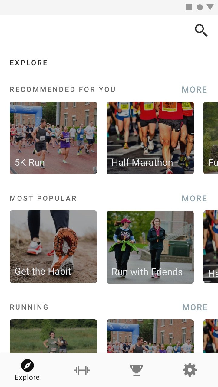
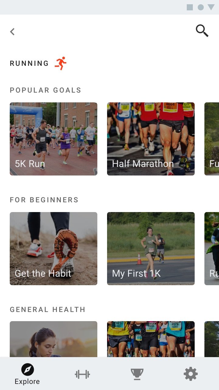
Instead of a Toolbar, I used bottom navigation for parity with iOS.
Finally, I double-checked my work by mocking up some quick Explore screens. I wanted to be sure everything was cohesive.
Selected works








©2025 Radley Marx All rights reserved. Schedule a chat