Introduction
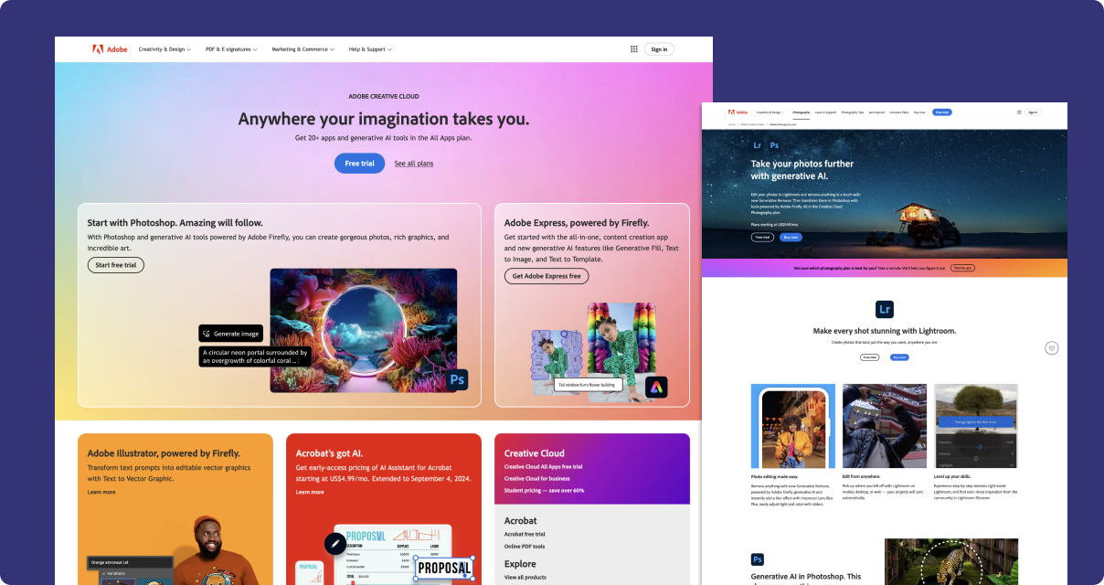
Consonant is an internal design system based on Spectrum, Adobe's design system. Our library is responsible for the adobe.com website, including marketing pages for over 50 products.
After four years of building 0 → 1 design libraries for agencies and start-ups, it was time for me to take the next step and learn how to maintain and scale an enterprise-level design system.
My role
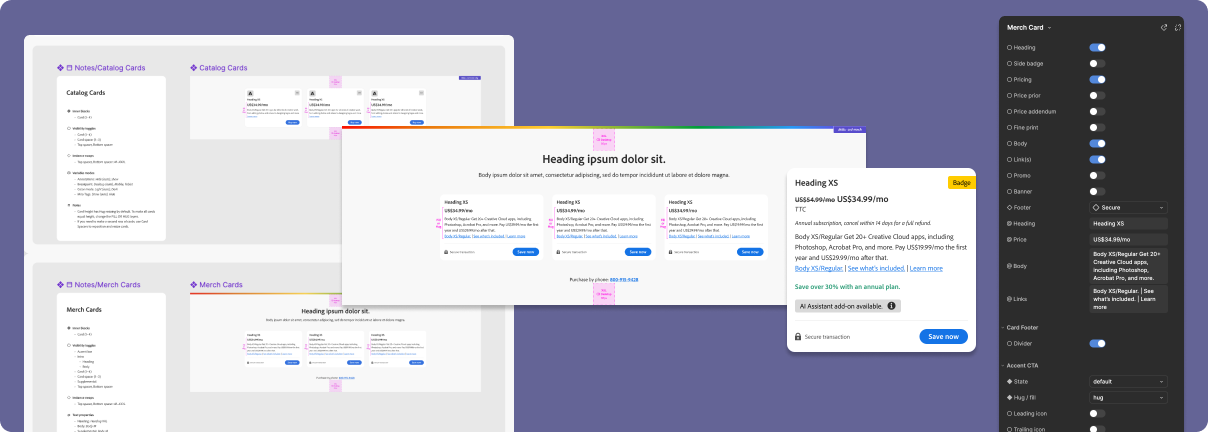
I'm part of a small team dedicated to building and maintaining Consonant. Initially, I helped them complete the transition from Adobe XD to Figma. Now, I am essentially the lead designer, responsible for the holistic vision of the Figma library.
Design Ops
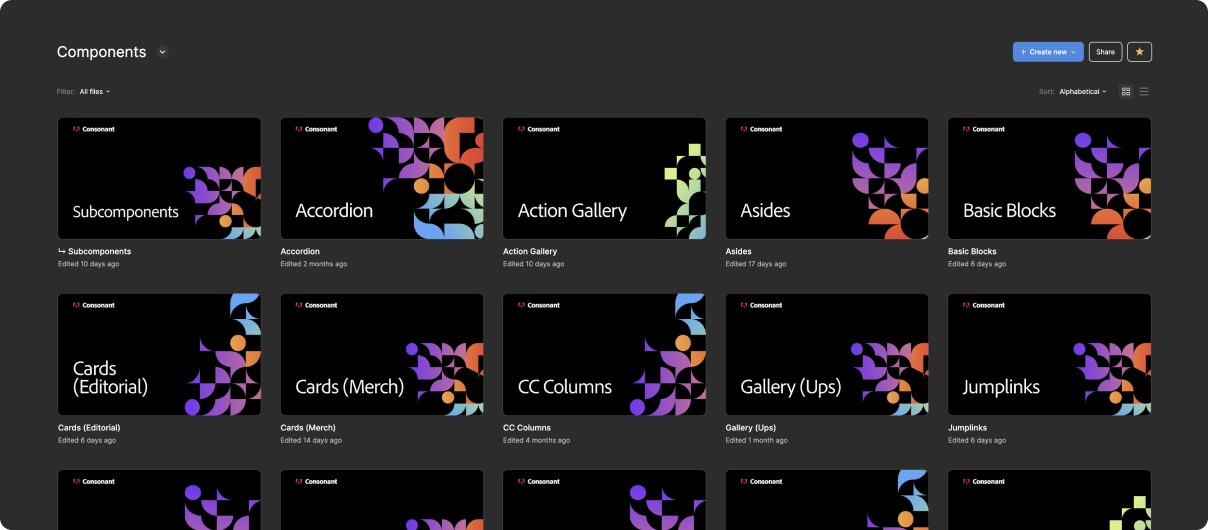
Components workspace
One early challenge was introducing a modern approach to organizing files and layouts in Figma. When I joined, design files were scattered among multiple teams, projects, and personal folders.
I quickly established a central repository for all of Consonant’s design work and materials. Traditionally, design files are a messy, stream-of-conscious assortment of pages and layouts. My workspace system still supports that — it just keeps it all in one place.
Touchstones and milestones
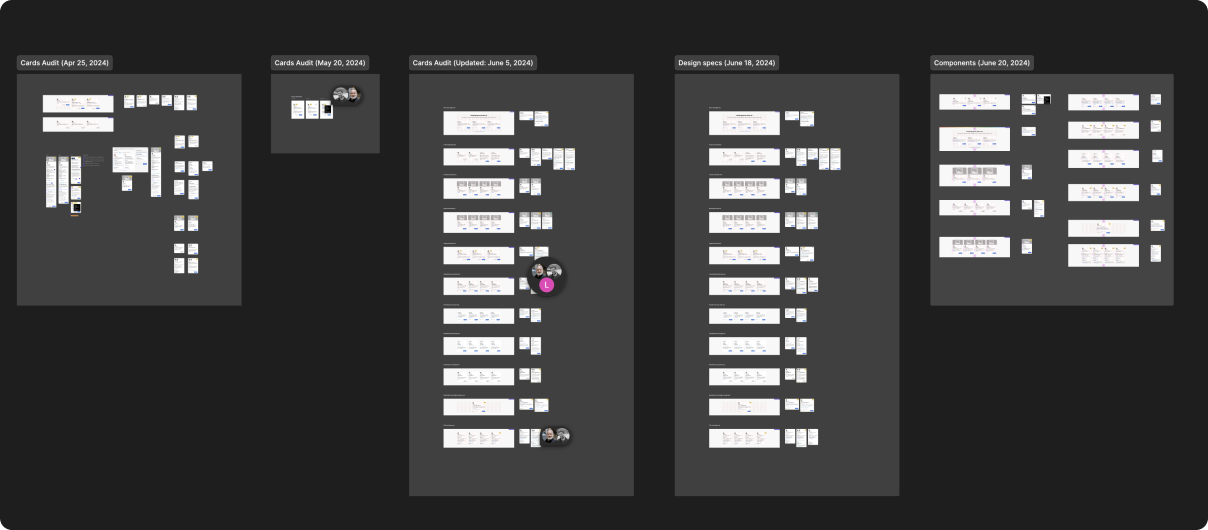
Within each component file is a set of clean, organized pages dedicated to design reviews. Relevant materials are collected and presented here as touchstones.
Touchstones provide a consistent destination for anyone to join the discussion. The left-to-right, iterative system provides a clear history of the evolution of each component.
Whenever we have a design sign-off, we copy the most-recent touchstone and add it to the milestones file. Milestones provide a separate and obvious record of what actually will be in production.
Deprecating components
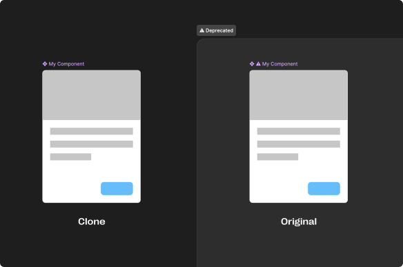
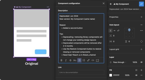
I established a deprecation process that allows us to update and replace components without disrupting ongoing work, nor cluttering design artifacts with deprecation messages.
Advanced solutions
Breakpoint variable mode
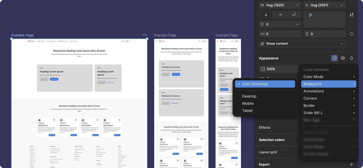
Instead of using variants or separate libraries for breakpoint layouts, we took advantage of Figma variables to manage breakpoint layouts using variable modes.
Breakpoint mode automatically updates layouts and styles for desktop, tablet, and mobile. This approach allows designers to swap entire page layouts with a single switch.
This solution was easy to apply to simple components, but became a fun challenge for more complex ones.
Annotations mode
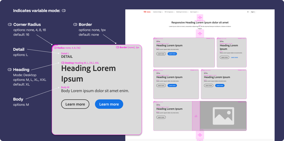
As we started implementing variable modes more and more, the biggest challenge we faced was explaining that they existed, let alone how they worked. We couldn't rely on users to refer to the documentation to find our "hidden" features.
Annotations are now built-in to all of our components. The solution was inspired by Figma's dev mode annotations. Our approach is better for several reasons:
- They're immediately accessible in all design layouts that use our components
- They directly identify features that use variables and variable modes
- They provide soft-governance for text sizes, spacing, corner radii, and other design choices
- They come with visibility options: hide all, show essential, and show all
The future
This role has been a huge opportunity for me, and my work on the Consonant Design System has significantly enhanced Adobe's efficiency and capabilities. I'm looking forward to diving even deeper into enterprise-level design systems.
Selected works











©2025 Radley Marx All rights reserved. Schedule a chat