Introduction
Lookout turned to First Person to overhaul its enterprise website. The goal was to shift from a SASE product company to a holistic Data-Centric Security platform, recognized as a Gartner Visionary. Another agency was responsible for the rebranding, while we provided the new narrative structure, website, and design system.
I was the technical designer, responsible for building the Figma design library and providing solutions for technical challenges. The creative team included a Creative Director, two Senior Art Directors, and me.
Phase 1: Discovery & concepting
Discovery workshop
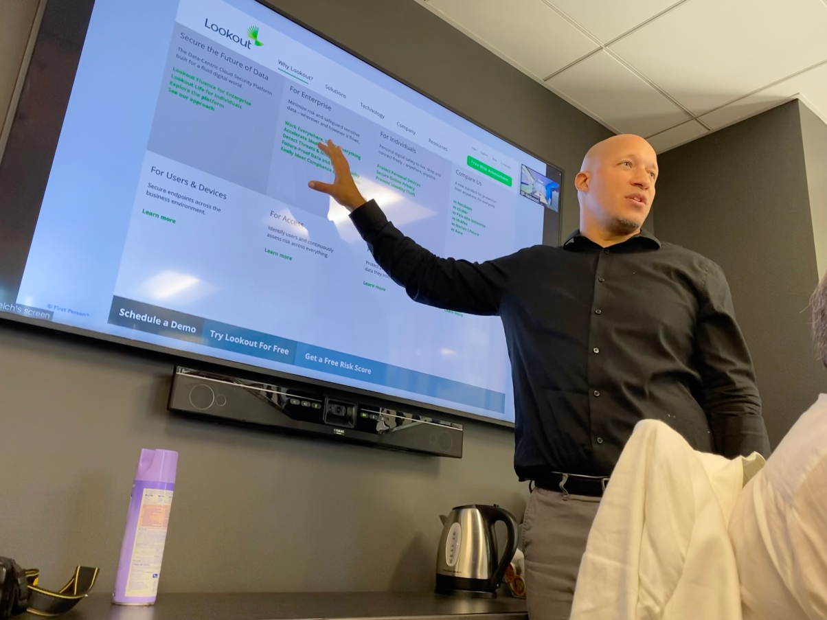
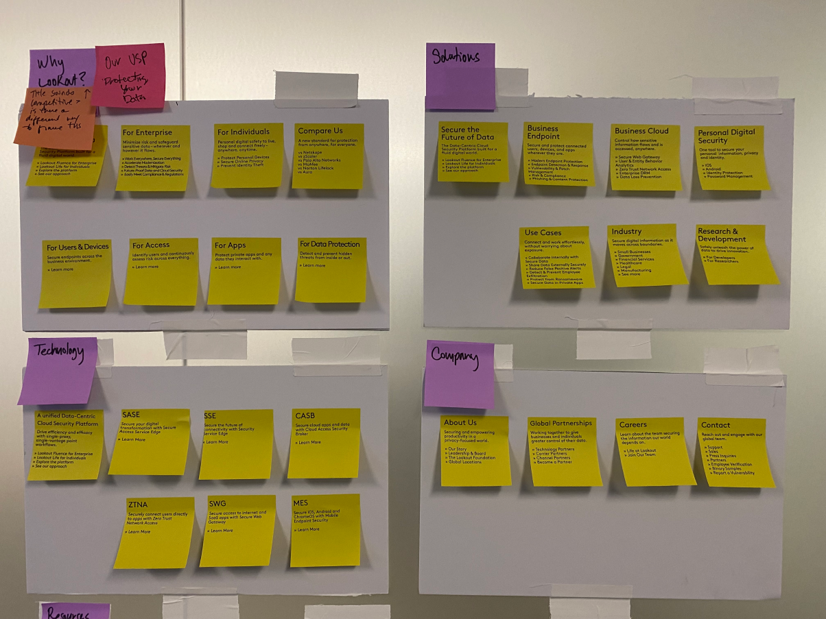
Our Narrative team conducted a discovery workshop to align all parties towards a unified structure for B2B and B2C services. Participants included the CEO and executive-level stakeholders. I assisted with the workshop, but didn't conduct or present anything.
"I don’t give out compliments, but these people really know their sh*t.
What First Person lead us through is just amazing."
- Jim Dolce, Lookout CEO
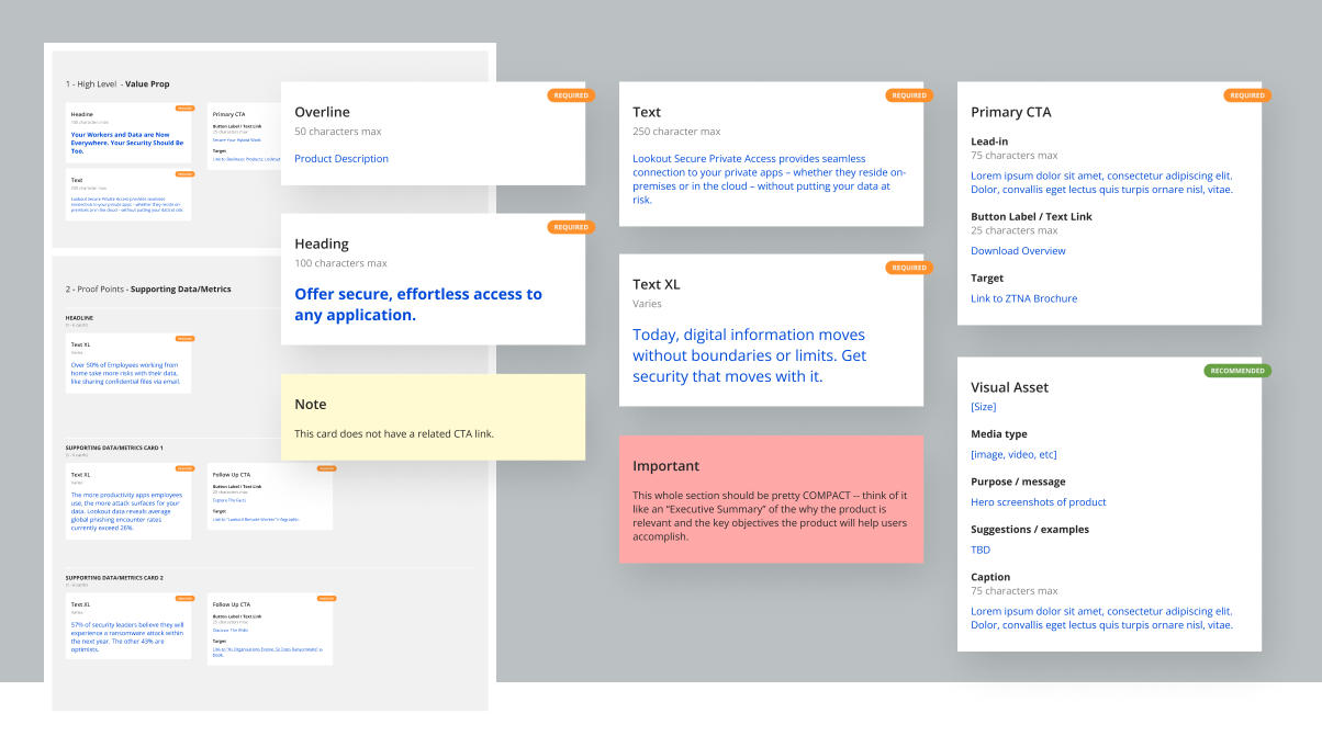
Narrative block library
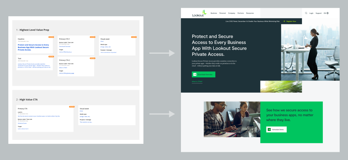
I was asked by our Narrative Team to find a new way to define narrative structure. In the past, they used primitive wireframes (in Milo) to convey structure. The layouts were not intended to be design wireframes, they were simply a means to present the order and emphasis of the content. Confusing, right?
Designers were told to ignore the layouts and only pay attention to the narrative content, but it didn't work. The first round of design concepts would always follow the layout structure. The wireframe approach was simply too similar.
We worked out a new system of uniform blocks that could present content with emphasis and order, but clearly has no layout structure. Instead of using Milo, I introduced the team to Figma, and created a small Figma library of reusable components they could use.
By the end of the project, the team had created over 2000 narrative blocks.
Color tests and accessibility
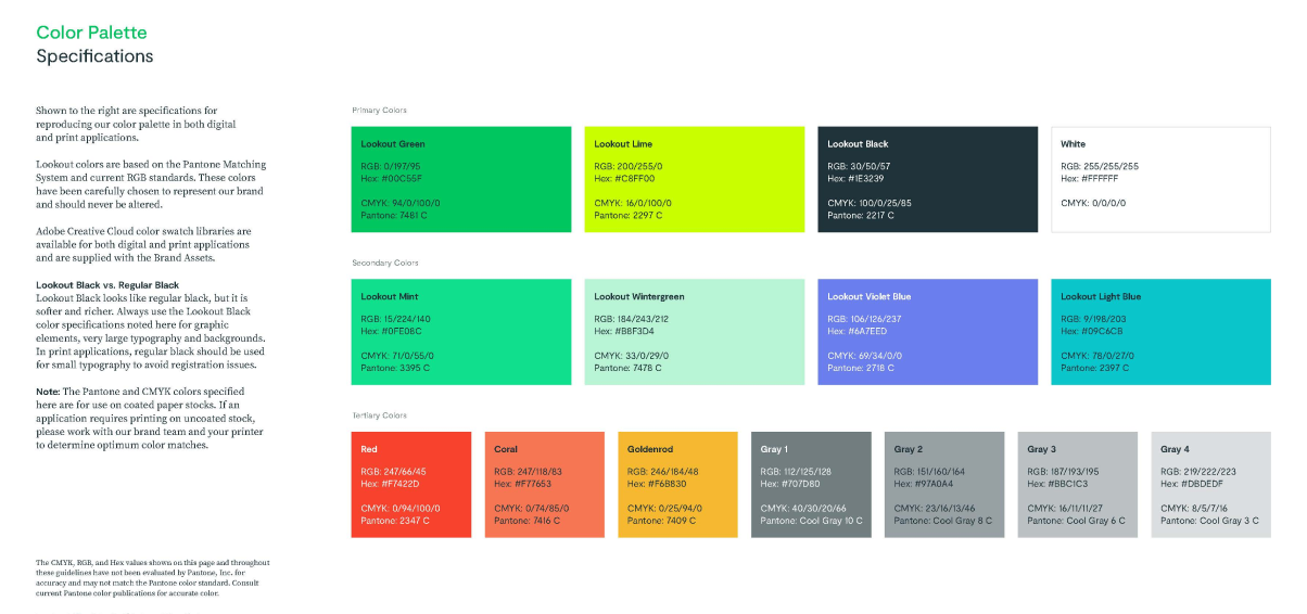
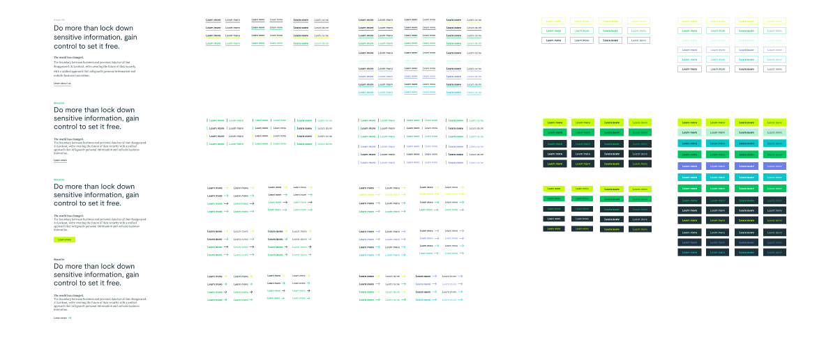
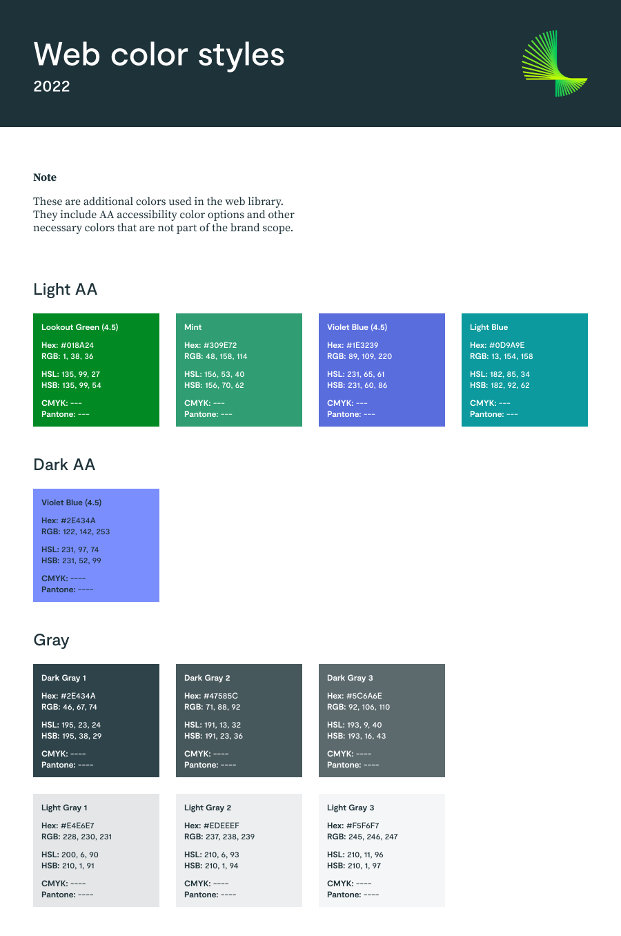
The new brand color palette had a few accessibility issues. Lookout Green was not a11y-compliant, Lookout Lime was simply illegible, and the secondary palette was reserved for consumer pages. This left us without an accent color for text links.
I generated a series of color studies that helped us determine a few promising color combinations. We ended up adding an alternate set of AA-safe web colors, along with six more neutral shades of gray.
Grids and breakpoints
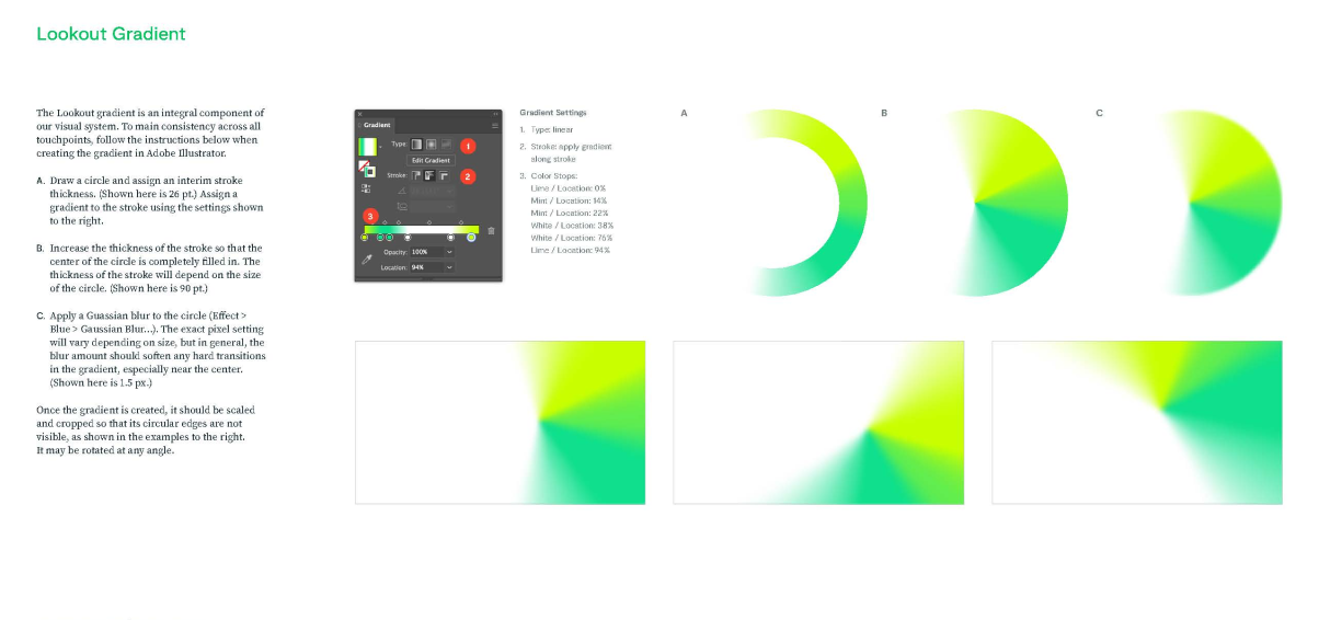
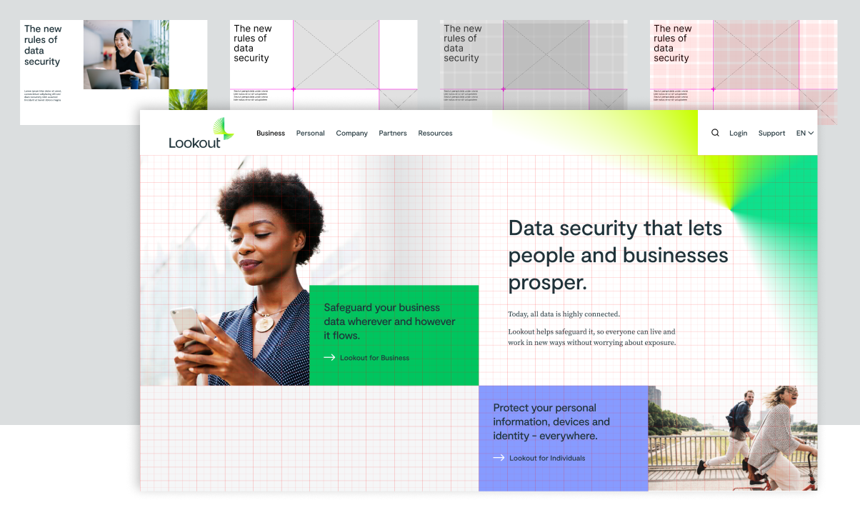
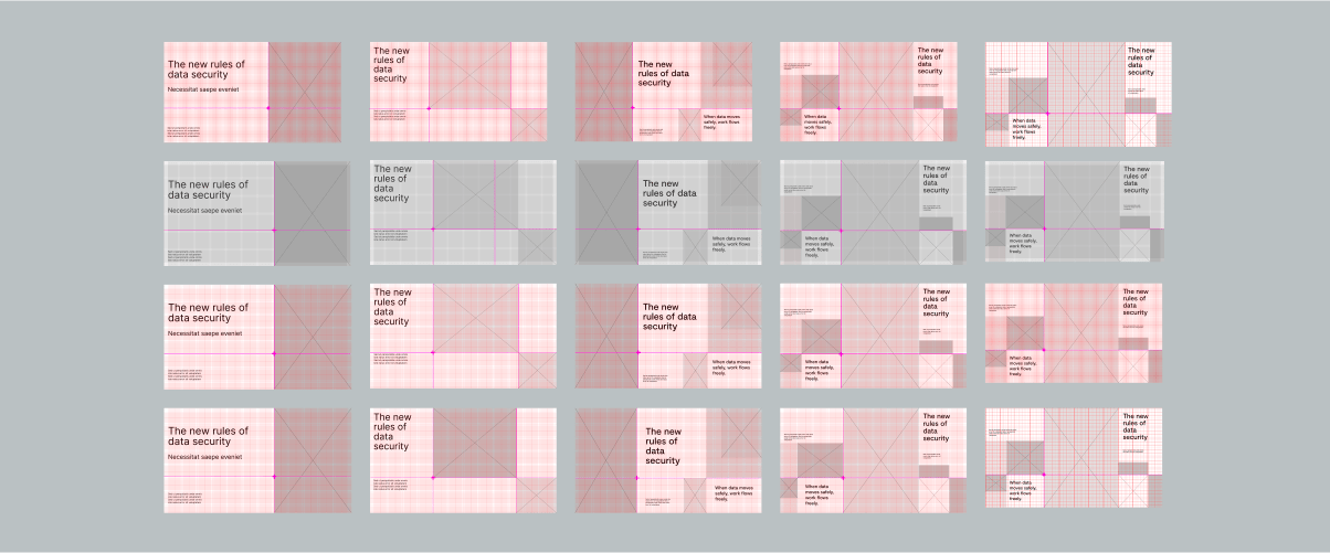
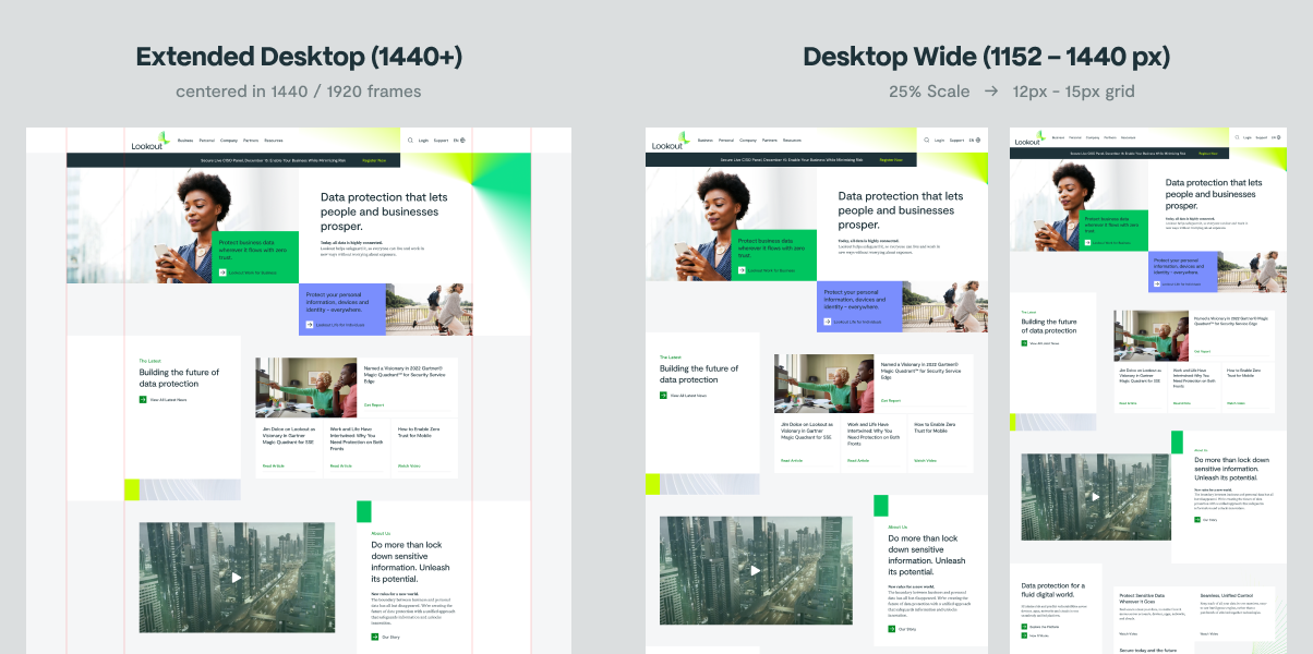
Another challenge we faced was determining a responsive grid. The brand guidelines only considered static, edge-to-edge and corner-to-corner layouts for print and slides. They didn't have a strategy for responsiveness. I produced a study of the original brand grids and provided a variety of solutions.
Figma library
Client onboarding & training
The client was fully committed to using Figma internally, but they were still making the transition from prior design tools. This was a concern, because they might not understand how to use the library we would be providing.
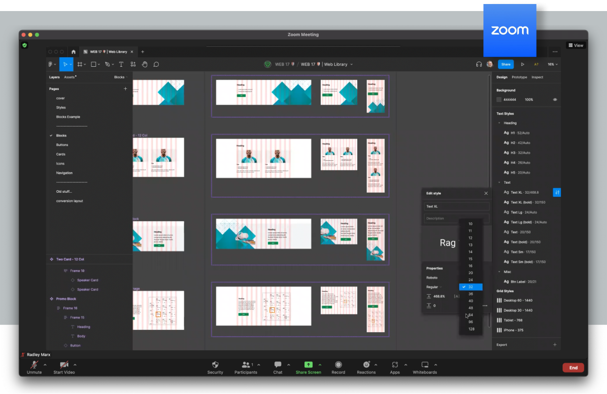
During the discovery phase, I conducted a weekly online training series to introduce Figma fundamentals such as styles, components, and shared libraries.
File structure
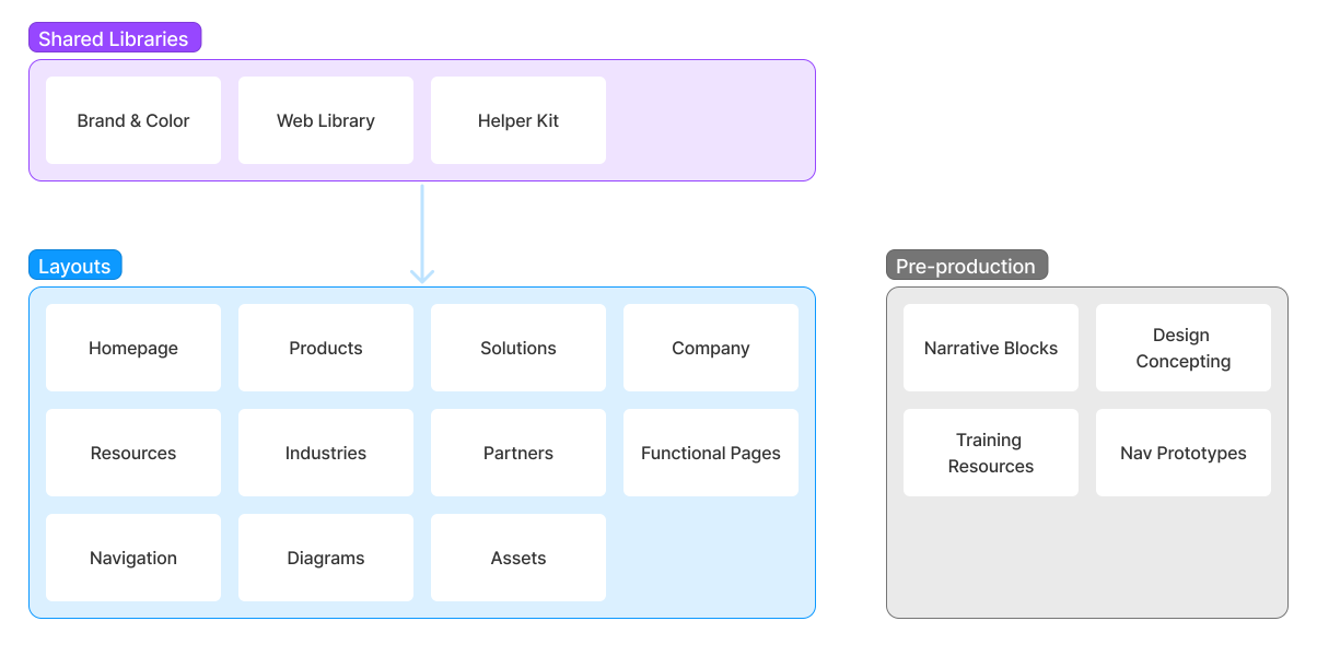
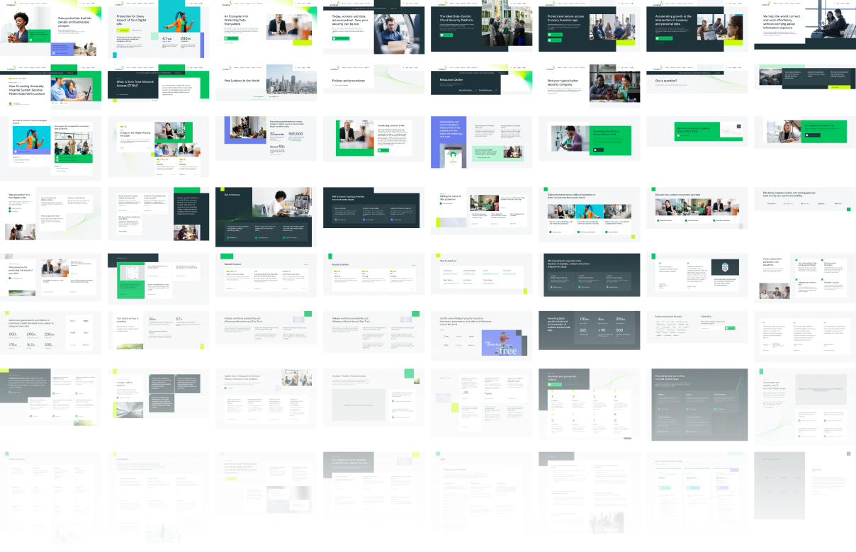
The Figma project consisted of multiple shared libraries and layout files. This approach offered flexibility for future scaling, while adhering to a single source of truth strategy.
Documentation was out of scope, but I felt it was necessary to at least provide basic reference sheets for text and color styles, adding brand guidelines where applicable.
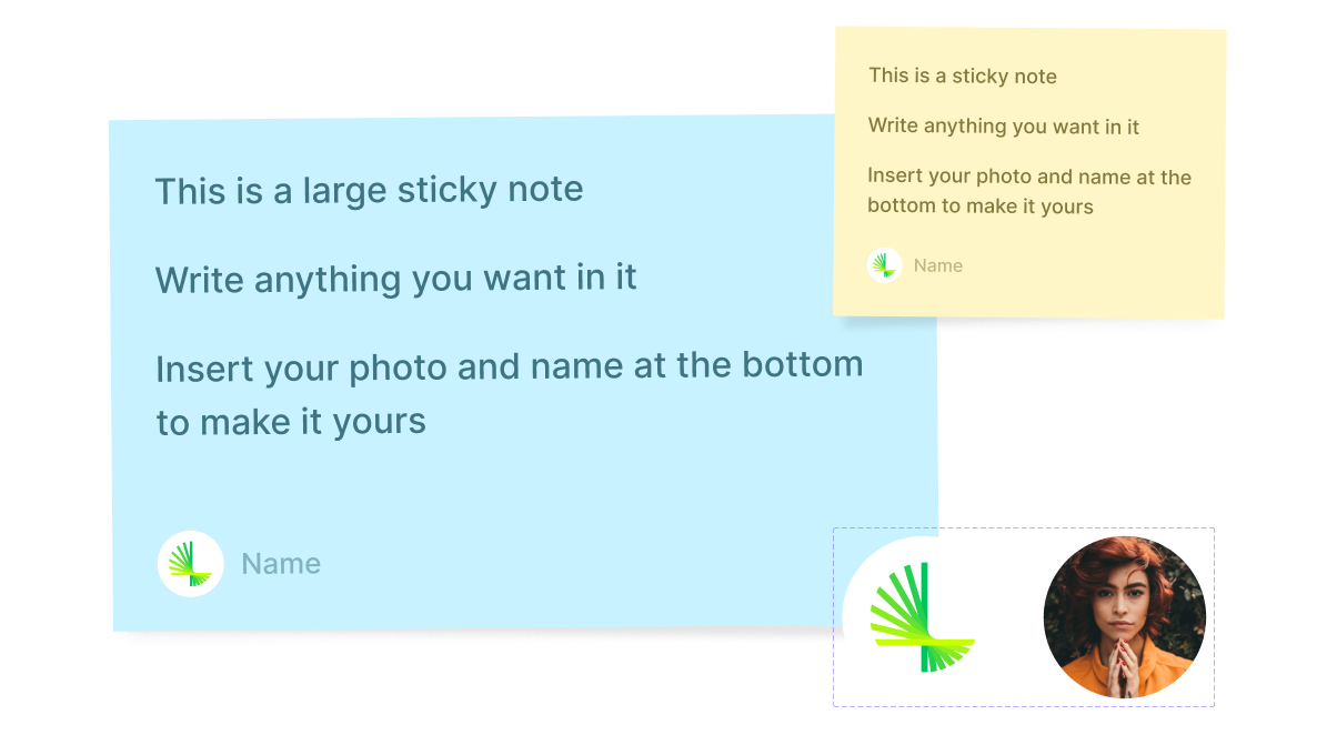
Helper Kit
This kit provides basic annotation tools. It’s based on Figma’s recommended best practices for organizing libraries.
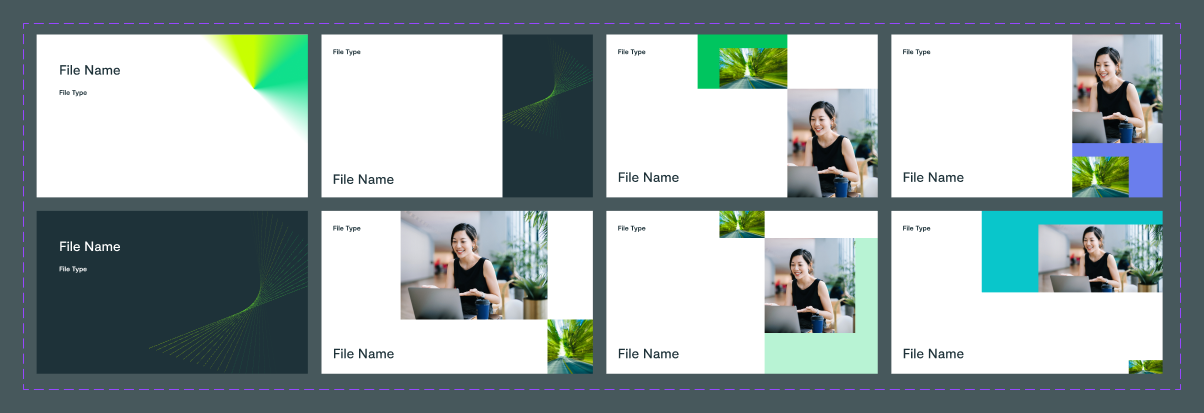
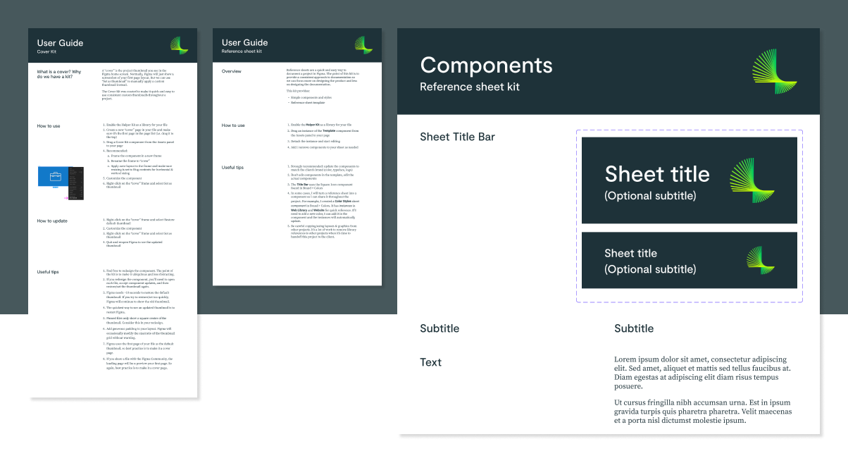
Brand & Color
Brand & Color was the core library, the single source of truth for logo assets, brand color styles, and documentation.
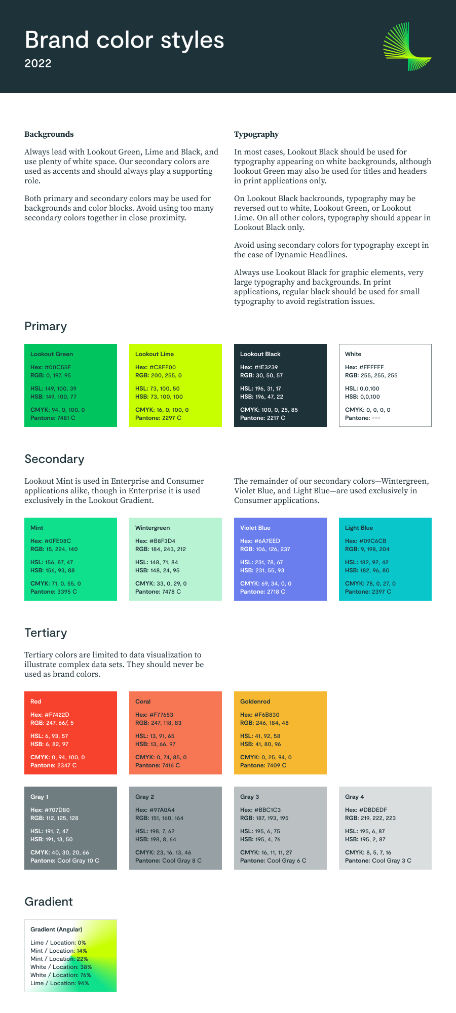
Web colors
We needed more options for colors than the brand had specified, including AA accessible colors.
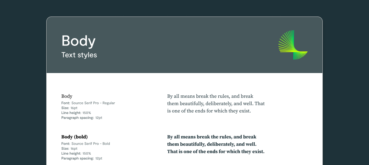
Text styles
Text sizes and spacing were defined in the Web Library. Reference sheets were provided, organized by type and platform.
Components
I used Figma's new component properties and nested instances throughout the library.
Properties are fantastic, reducing the number of variant we have to build. Unfortunately, nested instance turned out to be extremely awkward, particularly when many are required.
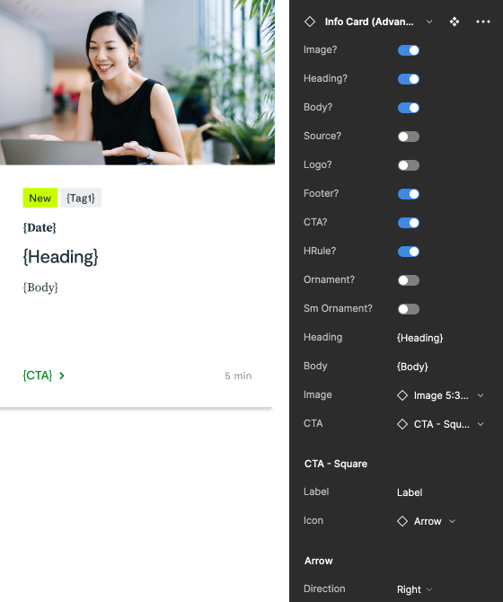
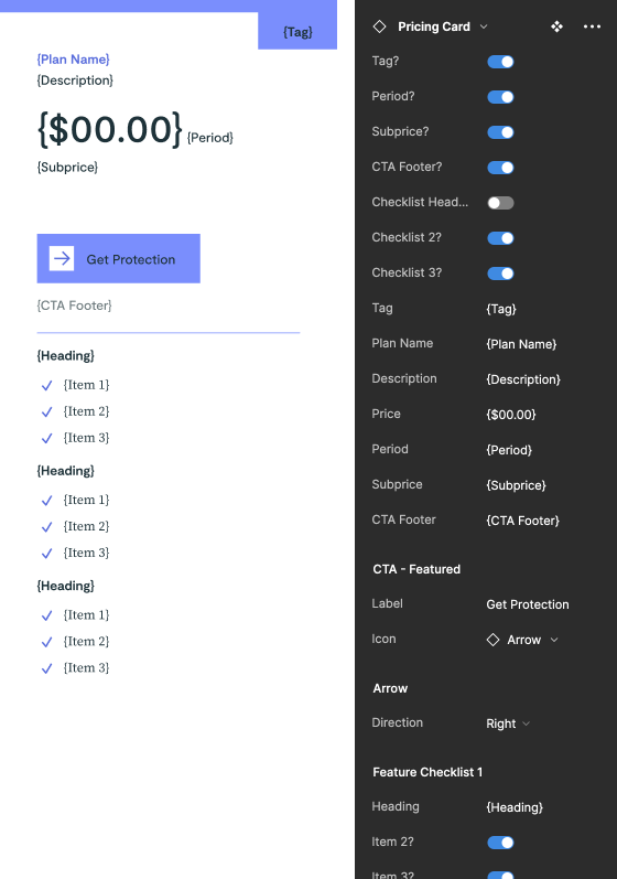
Responsive variants
Each component has a secondary component containing variants for responsive layouts. The two components contain the exact same properties, so they're easy to swap. The purpose was to reduce the complexity of frequently-used components.

Section templates
Page mockups were separated into sections and each section was converted into a block component. Making a responsive version of each of these was out of scope. Instead, these templates were designed to be detached when needed, and retain the internal components and auto-layout settings.
79
section blocks
100+
components
200+
responsive variants
112
text styles
27
color styles
6
grid styles
Takeaways
Use a dedicated color library
For the last few design systems I've built, I've always used a Brand & Color library for color styles. Lookout required additional colors for web accessibility, so I added them in the Web Library. But these colors will probably be needed for email campaigns, ad banners, and other use cases. I think it might be better if colors are defined in a dedicated library.
Component properties are great, instance swapping... not as much
Component properties are a game changer, significantly reducing the number of variants we need to build. In contrast, instance swapping can be awkward to use, especially when many are needed.
I'm satisfied with how I use properties, but I'm going to avoid using instance swapping when possible. This means flatter, redundant layouts. But they'll be easier for designers to use.
Try using touchstone and milestones
Figma makes it easy for stakeholders and others to leave comments directly on designs, but their ephemeral nature makes them difficult to maintain.
I'm considering two new file types to manage progress and feedback:
Touchstone files would be for non-designer feedback, such as stakeholder reviews. Comments can be retained, tracked, and archived without cluttering up design files. This file should not be connected to shared libraries, so old artifacts are not overwritten by updates.
Milestones would function similarly to touchstones but serve as the master deliverables. They would provide a record of final designs and theoretically align to production releases with version numbers.
Selected works









©2025 Radley Marx All rights reserved. Schedule a chat
