Wireframes
Obvious wireframes
The app went through two rounds of wireframing. The first determined a basic layout strategy compatible with all devices. The second specified product details for every screen.
Product Design
rough wireframes
This phase determined where things would go and how they could fit together. I wanted to be able to reuse layouts to reduce development time.
timer & today's tasks
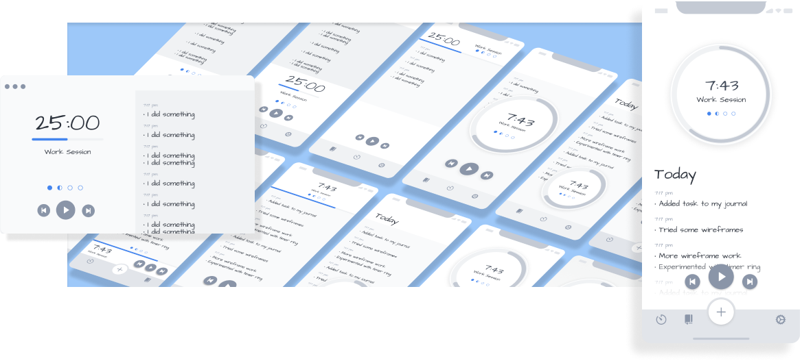
It was important to show the timer and today’s tasks at the same time. For iPhone, I designed a variety of timers and z-index layouts. I settled on a hybrid solution using floating controls and a circle timer.
multiplatform layouts
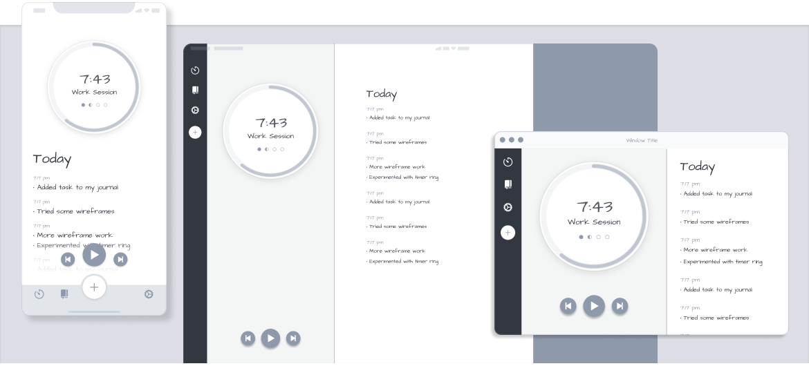
iPad and macOS layouts were easy to show the Timer and Today list side by side. The only significant change was the left-hand navigation bar.
journal
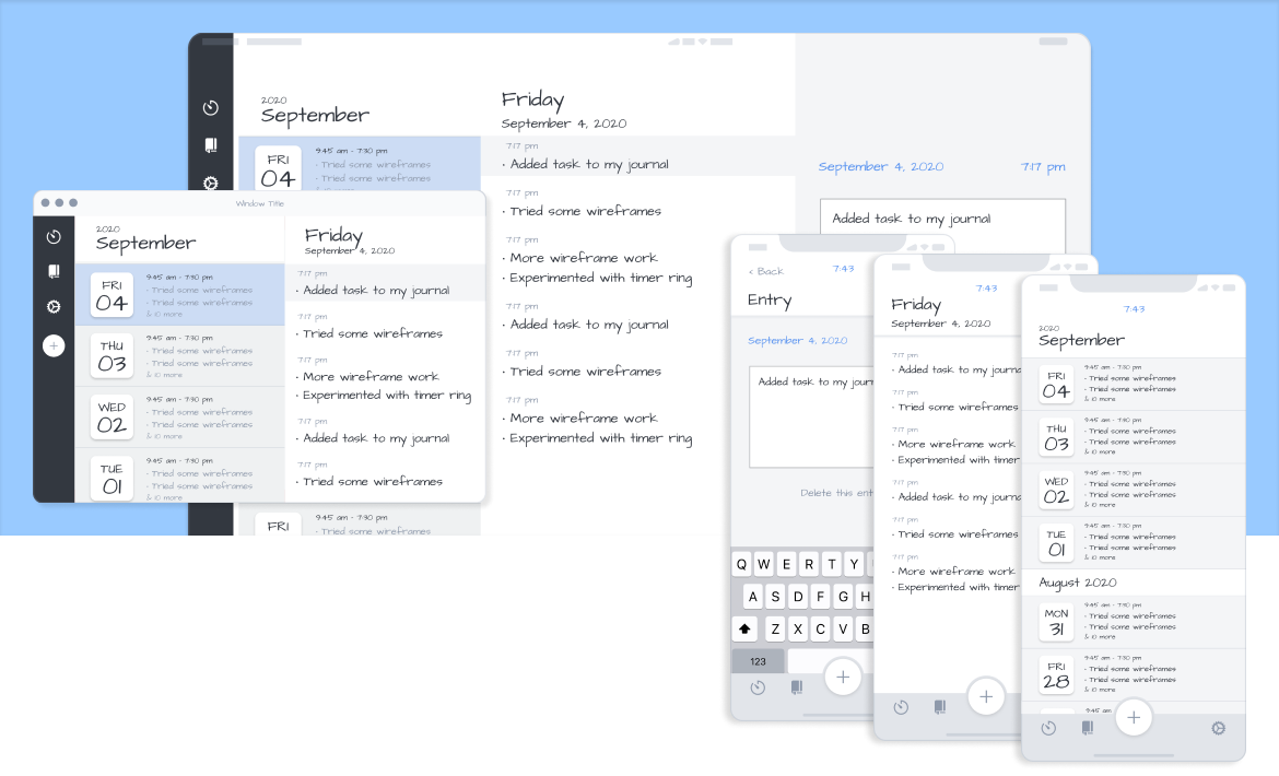
The Journal screen is divided into columns for your history, day, and entry. Depending on the device, the app could show one, two, or all columns at once.
Product Design
detailed wireframes
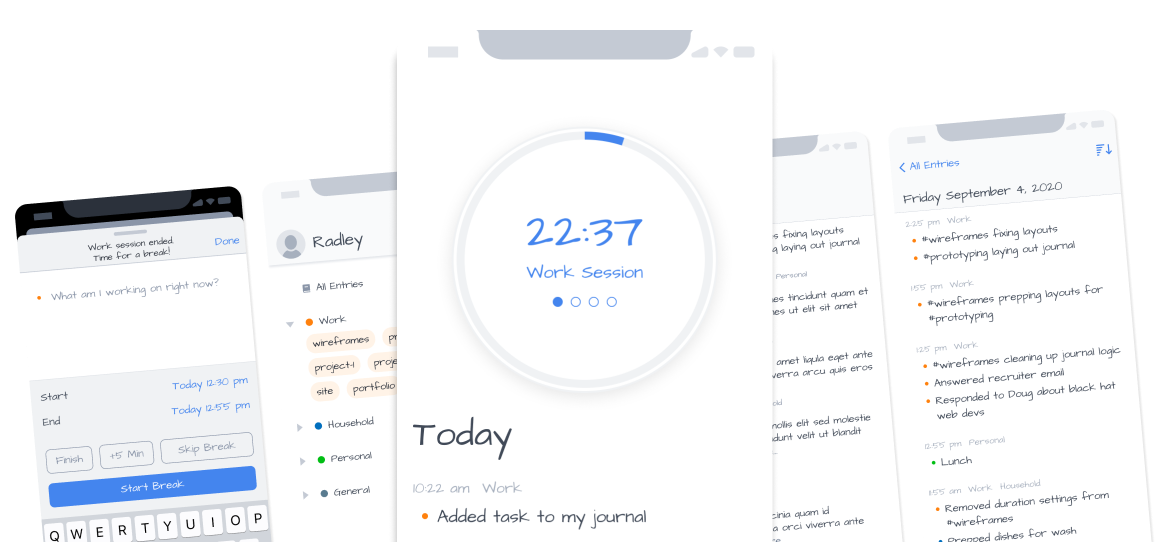
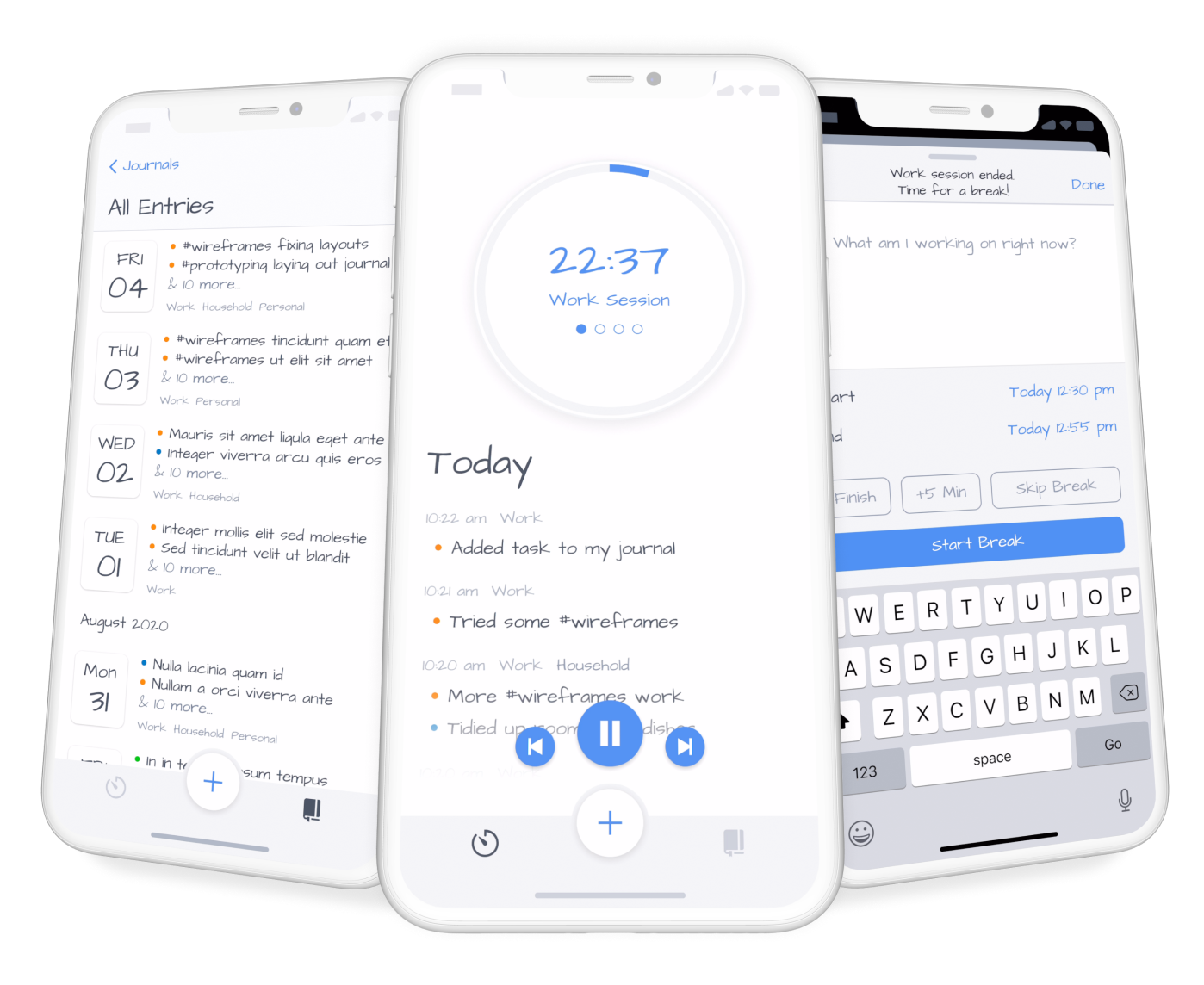
This phase specified how the app would actually work as a product. To save time, I only created iPhone wireframes.
parallax scrolling
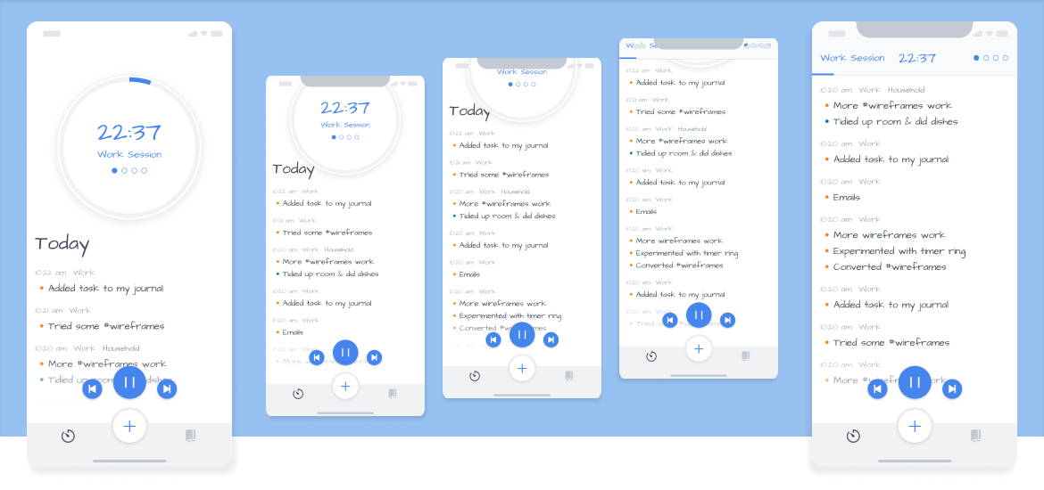
I mocked up an elegant scrolling solution. As the user scrolls the Today list, the circle timer would follow slowly using a parallax effect. When the circle timer exits, a timer bar will drop.
journal
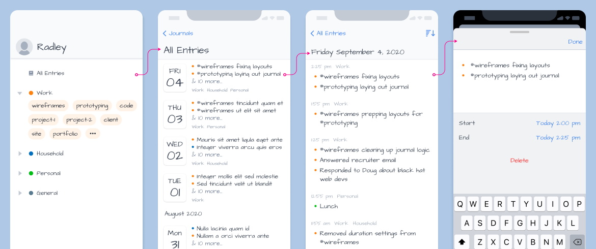
I created a new top menu to support color-coded journals and tags. Users could navigate through their history. Selecting an entry would open a sheet.
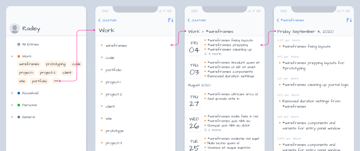
Alternately, users can browse by journal and tags. This user flow illustrates how to view all Work tags and browsing for #wireframes entries.
action sheets
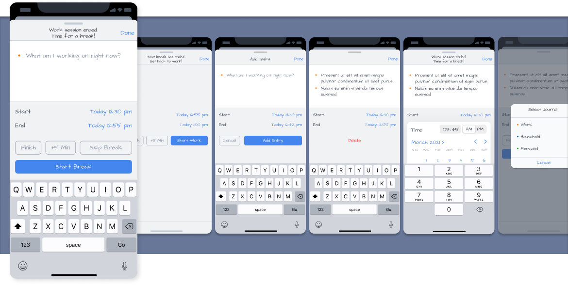
I'll use action sheets for creating and editing journal entries. They provide a consistent experience regardless of the entry point. I also added data values for start and stop time to better support a calendar view in the future.
settings
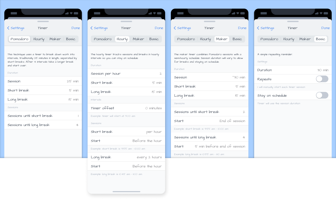
Part of the settings includes timer customization settings. Determining these settings forced me to clarify my timer concepts.
As a result, I created a new timer: the Hourly Timer. It’s more of an alarm than a timer. It triggers a set number of times per hour so you can add entries, takes breaks, and — most important — stay on schedule. It will be the default timer.
Selected works




©2025 Radley Marx All rights reserved. Schedule a chat