My productivity app is coming along, albeit slowly. There have been some significant changes behind the scenes which have required some ramp up before I could move forward.
This post is mostly a progress report to talk about changes I made a while ago to the Mac app prototype and to show some initial wireframes for iOS, iPad, and macOS. I also have a Figma prototype I put together to show how the timer screen would work on iPhones.
Let's dig in!
This year, I took advantage of the downtime created by Covid-19 to update my skill set. I made the switch to Figma for design and needed to learn how they handle libraries and components. On the coding side, I needed to do a deep dive into Swift to build this properly. I also started learning how to use Firebase, so data can be independent of the platform (for better longevity).
The Mac prototype
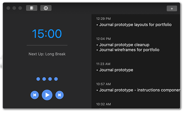
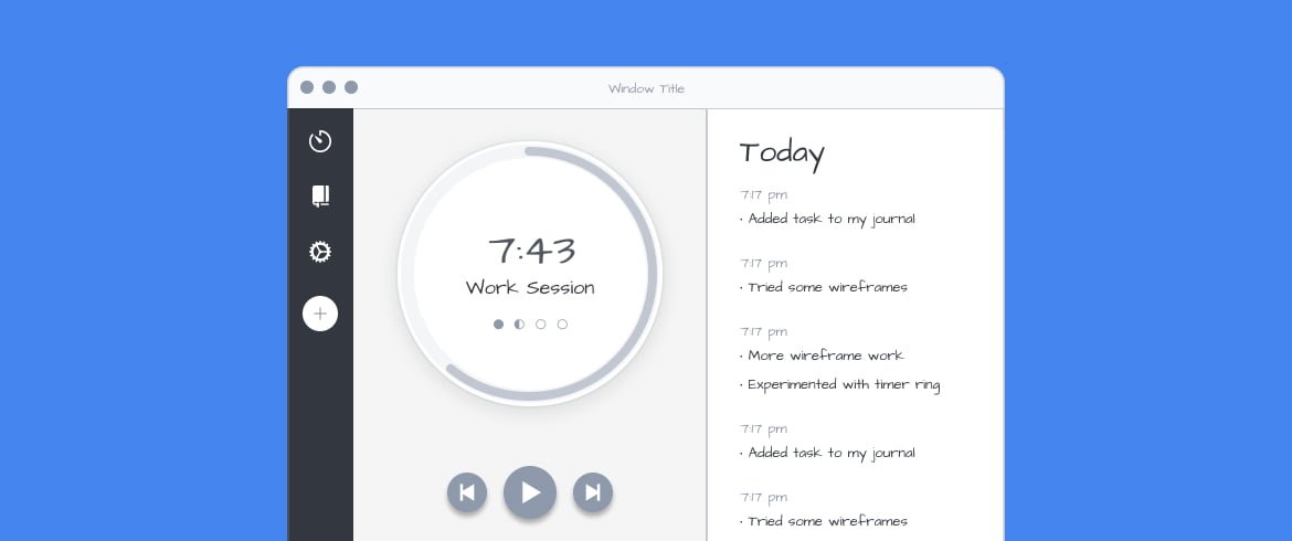
In my last blog post, I talked about how I ended up using the app a lot less because of the redesign. I ended up reverting the timer to include today's tasks and added a little more design detail:
The journal also got some attention. I added a history list of daily entries:
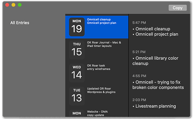
It's nothing fancy, but at least I could see everything on a daily basis (instead of one giant list). This was enough that I could actually use the app, which I have been using continuously .
One issue I ran into early on was Core Data getting completely wiped out when the app crashed. I was able to fix the bug, but I'm not confident I can prevent it from happening again in the future. I investigated using iCloud/CloudKit but decided to use Firebase. Firebase is a Google product designed for developers like me who need a data solution without being a data developer. It may get expensive in the future, but it's sufficient to get me up and running for an MVP.
Designing for iOS
In my last post, I was using a custom Swift wireframe kit built to plan out the journal and settings screens. This year I switched over to Figma, so I had to rebuild the kit from scratch.
The first challenge was converting the macOS horizontal layout to vertical for iOS:
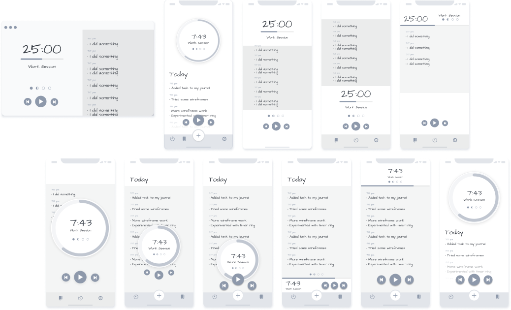
I tried several variations:
- it was important to show the timer and current tasks together
- a timer bar was easier to layout, but a floating timer clock would be more attractive to users
- the timer controls needed to be reachable at the bottom of the screen, but the timer itself would be better at the top
- bottom navigation: needed to consider buttons for the Journal, Settings, & Quick Entry
The final solution was a compromise. It has a timer clock up top with floating timer controls at the bottom. Tasks get added to a list under the timer. To view the full list, the user will scroll the page and the timer will scroll off the page (for now). I think I could fix it by adding parallax scrolling to the floating timer. I'm also considering morphing the timer from a clock to a bar when it gets to the top, but that's more than I need for an MVP.
Timer prototype for iOS
I created designs for the task entry pop-up panel, but felt it would be difficult to explain how they work. I decided this was a great opportunity to learn how to use Figma prototyping., so I created a short demo to show how the timer would function:
I'll just add a few notes on building the prototype. First, I learned that if I make any changes, they're immediately updated anywhere I've embedded the prototype. This is good & bad. It's good because a client can easily find and review the latest update in the same place. The bad is that it makes it impossible to show stages of progress with different versions without making an entirely new prototype (which is why this prototype uses newer wireframes ).
One interesting prototyping tidbit: I found Smart Animate to be very effective as long I add extra screens between some transitions. It helped if each screen transition focused on a single transition at a time, such as fading narrative panels before and after the pop-up panel animates, and not at the same time.
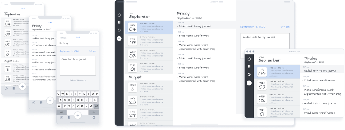
Designs for iOS, iPad, & macOS
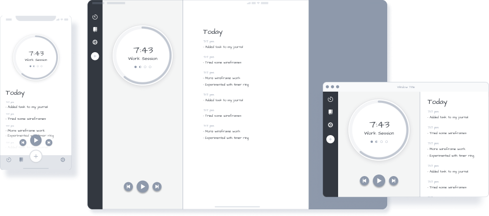
When my iOS wireframe started looking close to finished, I started working on the iPad and macOS wireframes. It's important to work on these concurrently because the different screen sizes introduce new layout challenges that may require changes to the original iOS layout.
I don't think I need to go into detail, so I'll just leave you with some screenshots of the final wireframe designs.
No Comments.