In my last post, I mentioned I had started working on a redesign for my time journal app. My strategy was two-fold: separate the journal into its own window and simplify the entry pane.
I used this opportunity to try out some conventional UX methods, including creating high-fidelity wireframes for the entry window, journal, and preferences. I also spent some time thinking about different User Types and their requirements.
Once the design was complete, I rebuilt the app, started dog-food testing it, and the result was surprising.
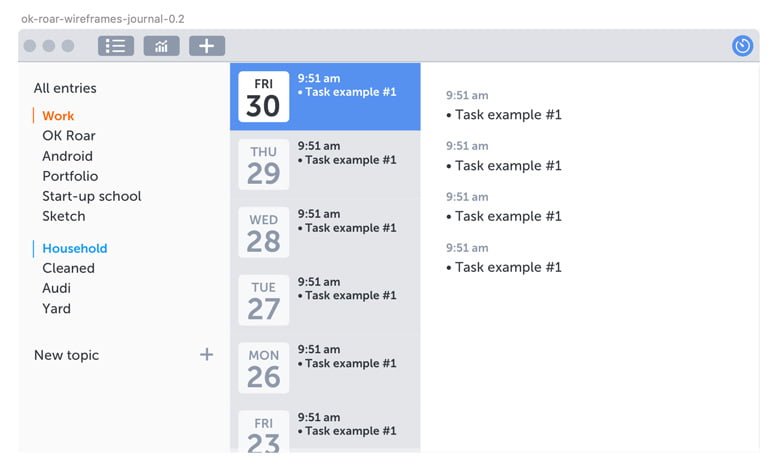
The Journal
There are plenty of wireframe kits for web & mobile but nothing for macOS apps, so I ended up making my own kit along the way based on Apple’s macOS UI template.
I essentially laid out all the ideas I had in my head. Entries would be formatted as time-based bullet points and organized by date. Users could create topic tags that could be grouped under larger, color-coded topic tags.
I wasn’t going to try and build all of it at this stage. Instead, I simply refactored the code and set it up in a way that would allow me to move forward later on. I didn’t even have date-separated entries: they were one giant list, which was fine.
The Entry Pane
My main focus was on updating the entry pane. Since I was already using the app as a journal, I needed this part to work and be as fully featured as quick as possible.
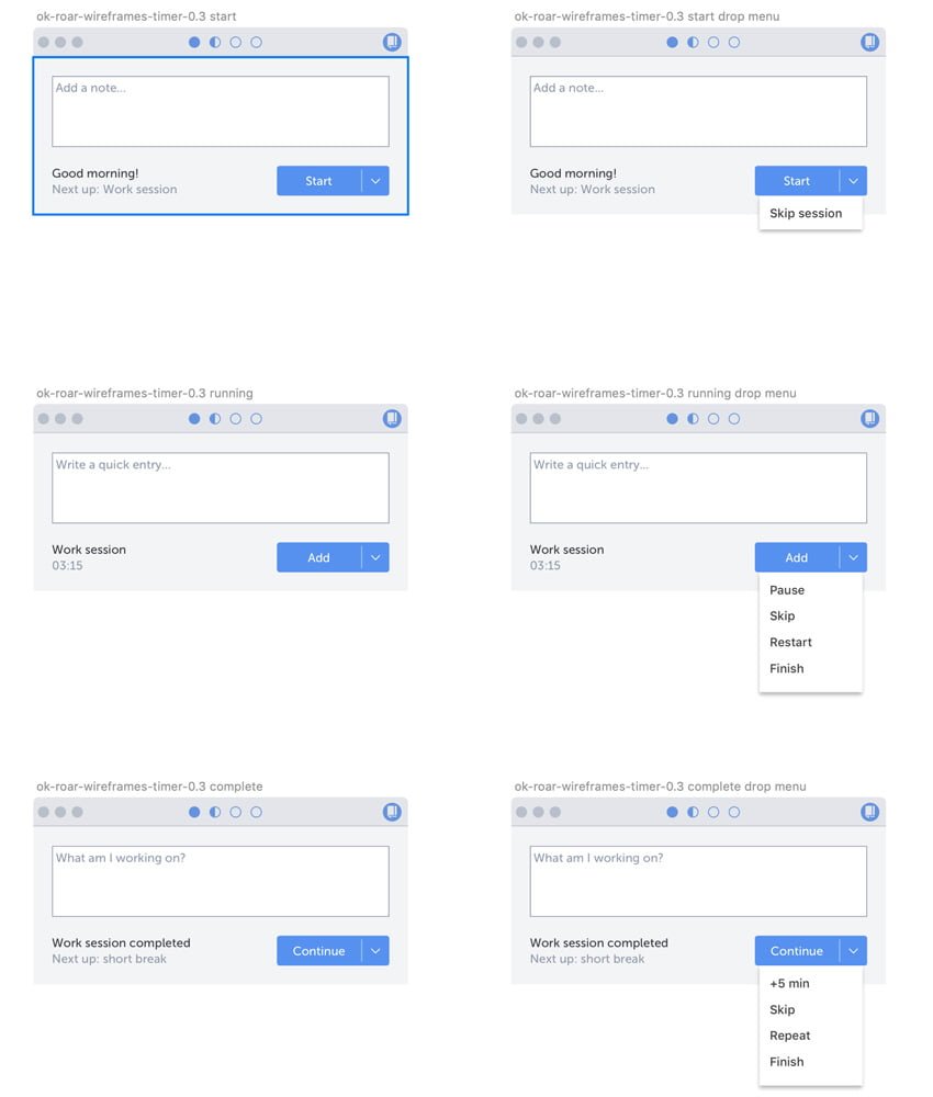
I wanted to get rid of the clutter and overhead of my prototype, so I simplified it to just a basic text entry box and submit button. I even reduced the countdown clock to be de-emphasized text so it wouldn’t be distracting.
Like the journal, I didn’t want to build anything too advanced at this stage. I refactored the app and used existing macOS components.
The Results
Something strange happened after I implemented the changes: I stopped using the app!
I’d forget to start it in the morning, or I’d stop it and forget to restart it. The app worked and didn't have any bugs, I just didn't feel inspired to use it (I even tried adding emojis to the layout).
What happened?
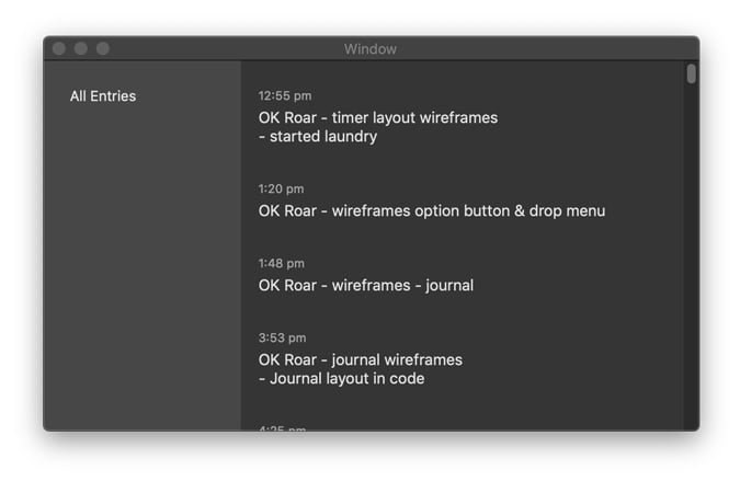
After some consideration, I realized that I’d overlooked a critical feedback mechanism in the original design: seeing my list of entries grow each day. It turns out watching that list grow was a huge motivator to adding more entries.
Unfortunately, this means I’ll have to revert the app. But it does serve as a good example of why JIT design & development is good practice. I didn’t over-commit myself to a lot of design and development that I have to undo. I should be able to revert this pretty quickly.
No Comments.