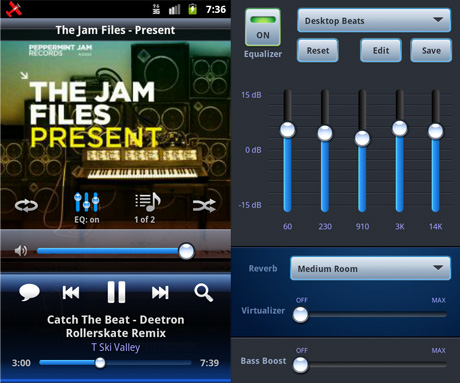
We just pushed the next big update for Cloudskipper. What's new?
- EQ, Bass Boost, Reverb, & Virtualizer for Android 2.3+
- placed a search button in empty control bar slot
- rearranged the audio player layout
- better layout for small screens
- rearranged the Settings
- set the lock screen action buttons to click instead of long-click by default
Most of these changes are motivated by your user feedback and customization seems to be the key ingredient. Mike pointed out that this is probably the biggest difference between the iOS and Android platforms: iOS does great design, but has almost zero flexibility. Android is more open to interpretation; users and developers want the flexibility to customize anything and everything.
So that's now part of our strategy - make Cloudskipper super-flexible while maintaining a super-clean interface.
Today's update is meant to make these changes easier. For example, we planned to have a streaming button in the control panel to make it easy to stream from your device to your desktop computer and stereo. But that's now much further down on our todo list, so the space would have been empty for a while.
Another example: new Android devices don't come with a built-in search button, so we have to provide one in the layout. But not everyone needs another search button. So how will that work? We decided that last slot is will soon be for a custom "tool" button. For now it will just be Search, but soon you'll be able to pick which tool you want there. This is why we also redid the player and Settings layouts - we need room for more buttons and settings.

No Comments.