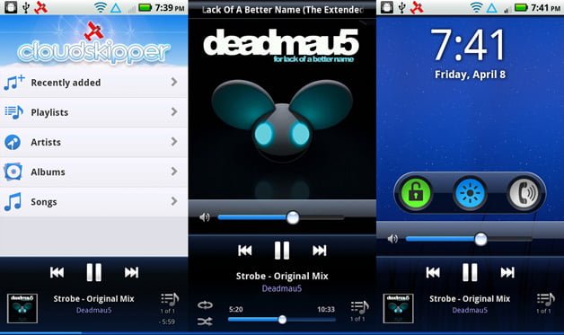
With the release of Cloudskipper coming up next week, I thought this might be a good time to show off some UI pron. Great UI/UX takes time and many iterations, so for UI/UX geeks like me it's fun to see how it can evolve. Even starting with decent graphics, there's a lot of tugging and pulling to make an app work just right. (more…)

UI/UX evolution: Cloudskipper on Android
[…] few weeks ago Radley posted a fun write-up with lots of pictures showing the evolution of Cloudskipper’s UI. It starts with the initial […]
Nice post. Love the player mainly for the UX. Awesome team work! In certain pics, I see few icons that I dont see as part of the player I downloaded. Like the icon with a rectangle+up arrow and a icon with square+tick. Am I not seeing the updated player? But I do have the new UI though.
Those are future features… =)
©2025 Radley Marx All rights reserved. Schedule a chat