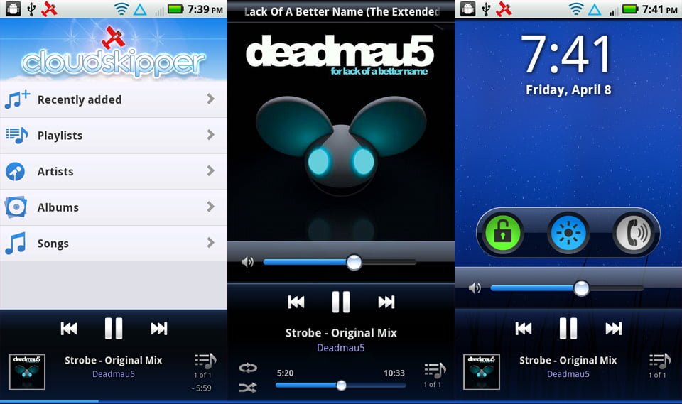
We pushed out the second beta for Cloudskipper today. The theme for this release is "easy": easier navigation, easier to view, and easier to use. This is a major update with almost a complete rewrite of the base navigation and skins.
Early feedback told us you wanted to be able to slide stuff around better. So instead of Google's recommended activity-based navigation, the lists are now a set of "slidey views" that can be easily moved left and right. The app feels much nicer now, more in line with apps such as Tweetdeck, Twitter, and the Android home screen.
You also told us it was too dark, so we switched to a light theme for the main navigation, adding a colorful new logo to the library screen. We're keeping the black theme for the main player screen: it just looks better, particularly with new album-artwork reflection and timed-fade-out controls.
While researching other Android players, there's one particular feature that's traditionally ignored, yet many people are asking for: onscreen volume slider. It's tricky to use the side volume buttons when your phone is in a case! We added large volume controls to the main player and lockscreen.
For those who hate the idea of onscreen volume controls, we also added the option to turn them off in our new Settings panel. I also added an option to remove the Android status bar in the audio player (which gives the player a sharp look when the controls fade out).
We're both really happy with this one. It's starting to feel like a real app.

No Comments.