Featured Image

Obvious: wireframes

January 8, 2021
 · 
4 min read

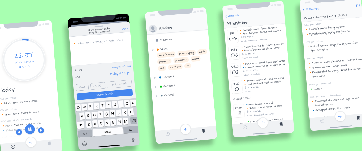
I recently completed my second round of wireframes for my Productivity Log app [update: now named Obvious].

In the first round, the goal was to take the layout of my Mac prototype and translate it to the iPhone and iPad. This time, I had to expand my scope and resolve everything I could figure out with wireframes so I could move on to high-fidelity designs.

The biggest difference this time was how to organize entries. This organization would determine my layout components and data models. I also had to be able to explain how my new timers work, along with other user settings I needed for an MVP. Finally, I needed to layout mundane stuff like signing up, editing entries, and error states.

Let’s take a look.

Journals & tags

I spent most of my time trying to figure out the simplest way to organize entries. I initially considered a hierarchical tagging structure similar to Bear but settled on a hybrid approach of color-coded journals, each with its own set of tags.

Research had found that a combination of folders and tags was the best way to organize information. I didn’t want to go too deep this early, so I had to figure out a clever solution to limit scope while still providing a natural UX.

It would take too long to explain all of the business & design decisions I had to make. As a quick summary, I settled on the following features:

  • view all entries
  • create, delete, and sort journals
  • view entries of a single journal
  • view entries of a single tag
  • edit entries (content, duration)
  • view all tags for each journal
  • display a limited number of tags in the top menu
  • track and edit tags, but not delete them
  • tags are created in-line as part of an entry, not top-down
  • data models to efficiently track journals & tags

Entry panel

In my first round of wireframes, I glossed over how the entry panel would function because I needed to understand my data model... which in turn required that the scope of journals and tags get sorted out first.

Entries went through a series of ideations. At one point, tracking the duration of an entry was considered optional for quick entries, but that made the UX confusing. Instead, I reduced and standardized the options, so creating and editing entries could use the same settings and very similar UIs.

I also had to think about how entries would be stored as data and how that would affect interaction. My choice is between saving the full entry or individual events of each entry as key objects. I expect I’ll decide that after I dive deeper into database management.

Today timer

The timer didn’t change too much. I explored a series of layouts for the Today list items. I’m still not settled, but the current design features an overline with a timestamp, journal names, and tags.

I also worked on a simple dropdown timer to be shown when the user scrolls the primary circle timer off the screen. Still not great, but gets me to the MVP.

Settings

Aside from the journal, the key differentiator of my app is the timer options. In addition to a basic timer and Pomodoro timer, I wanted to create a new type of timer that respected your schedule, dubbed a Maker timer.

In the process of trying to specify and describe the maker timer features, I realized that it would help if I added an intermediate timer that helped translate between Pomodoro and Maker options. The new timer, an Hourly timer is essentially is triggered a number of times per hour rather than after a fixed period of time.

The only other complex setting was the alerts. Beyond the alerts at the end of each session, I wanted to address two new features. First, the app needs to send a notification to remind users to start the app each day. Second, I wanted to explore the idea of a pre-alert — a click or sound is triggered a minute before your break so you can be better prepared to shift mental gears.

I also added settings for organizing journals, getting support, and app info. These are placeholder-quality for now; I expect to finish them just prior to release.

Sign-up flow

Last, I mocked-up some sign-in / sign-up screens. I haven’t dug deep enough into Firebase to know how the third-party steps will look, so I focused on the email flow. Again, I expect that I’ll understand these screens better when I start to implement Firebase authorization.

Tagged: FigmaWireframes
Comments

No Comments.

Leave a replyReply to

footer-logo

Twitch   •   Mastodon
Twitter   •   LinkedIn   •   Mixcloud

thank you for visiting  ❤︎
View